Our development services Website Design


Purple Details and White Surfaces Establish a Visual Language
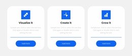
Purple is used as a connecting visual role throughout the Development Services block: it appears in the heading, accents, circular icon areas, and More buttons. Against the light gray background, the purple elements guide attention without overwhelming the three white rounded cards. App Development, Mobility Services, and Consulting therefore share a common visual language while retaining distinct content identities through their titles and descriptions.
The card treatment reinforces that language. White surfaces repeat the same contrast relationship, rounded corners soften the geometry, and centered typography gives each offering an orderly presentation. Because the cards are evenly aligned in one row, the visual system reads as deliberate repetition rather than three unrelated designs. Generous spacing around the centered introduction adds a quieter area above the more structured card group, creating visual contrast through density as well as color.
Within a broader website design, this block could contribute a recognizable services motif that other sections might echo through related color roles, surface treatments, or button styling. It should be understood as one expression of the site's visual direction rather than proof of a complete site-wide identity. The block's value lies in the relationships already visible inside it: a restrained background, repeated white cards, circular purple accents, and aligned actions that make the services area feel connected and intentional.
Customize with Nicepage
Open this ready-made template in the Website Design Builder and customize it visually in the Nicepage editor. Replace demo content, edit page sections, and adapt the design to your project without rebuilding the template from scratch.
Edit Template Offline
2. Create a new page or select existing
3. Click Add new block, search for id 679319 and click enter
Edit Template Online
Create Awesome Websites


Free Nicepage Builder
Keywords
Create a Consistent Design Across the Website
Define a Site-Wide Visual Style
Use Theme Settings to establish the visual foundation of the website across its pages and sections. Set global Colors, Fonts, and Typography so the site follows the same design direction instead of styling each page independently.
Coordinate Colors and Typography
Choose a color scheme and font combination that fit the character of the website, then fine-tune Headings H1-H6, regular Text, links, buttons, quotes, lists, and other typography styles. Consistent use of these settings helps create a clear visual hierarchy and keeps recurring design elements recognizable throughout the website.
Add Motion and Interaction
Use Animation Effects to make the website design more dynamic and interactive. Elements and Containers can use effects such as Run On Display, Animation On Hover, and Animation Sync With Scroll to introduce content as visitors move through the site or respond to user interaction. Animation Presets provide ready-made effects that can be adapted to the visual style of the website.
Keep the Website Visually Consistent
Apply the same design direction to shared website elements such as the Header, Menu, and Footer. The Theme Settings Panel brings common site-wide styling controls together, making it easier to maintain a coordinated look as the website expands across multiple pages.
This workflow makes the template a useful starting point for creating a website with a consistent visual identity, coordinated colors and typography, shared design rules, and interactive effects across its pages.