Global business consulting Website Design


Edit Template Offline
2. Create new page and search for id 6062898
Edit Template Online
Create Awesome Websites


Free Nicepage Builder
Keywords
Charcoal Contrast and Royal Blue Accents Define the Consulting Identity
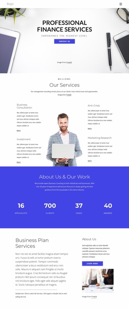
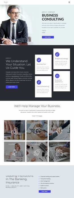
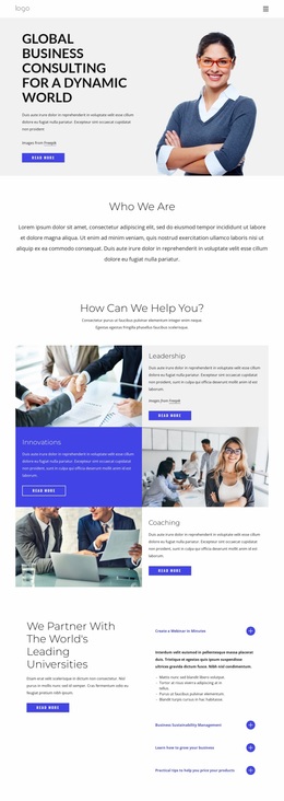
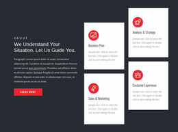
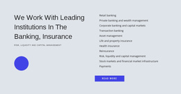
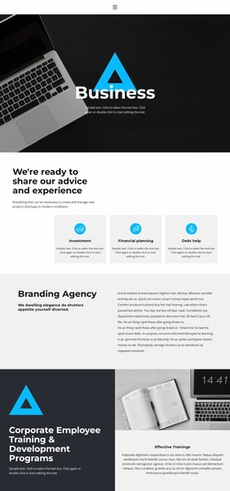
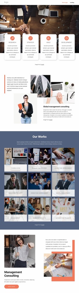
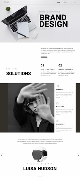
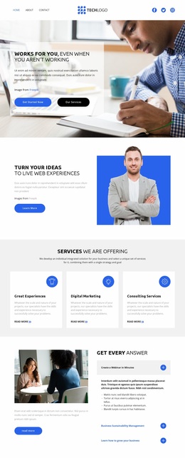
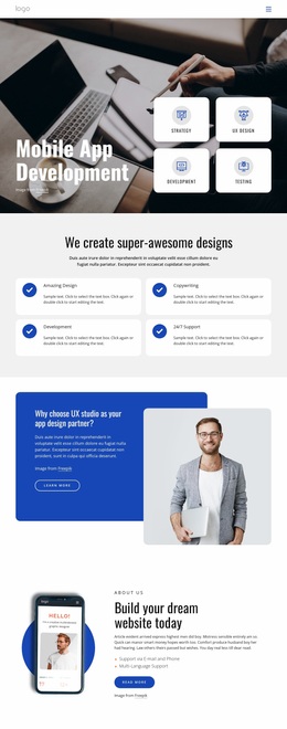
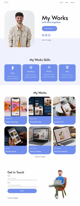
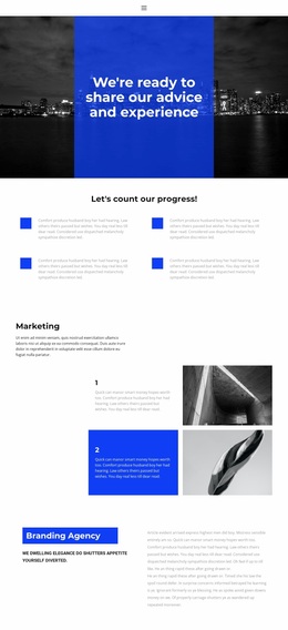
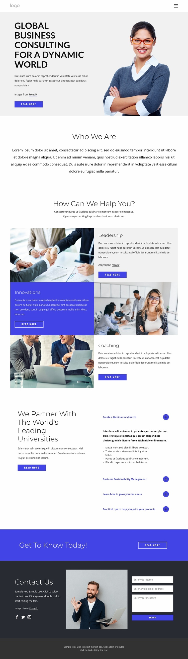
The visual language begins with a light, spacious foundation that gives the page’s large sans-serif headings room to establish hierarchy. Dark charcoal areas provide strong contrast, while royal blue appears as a focused accent in the callout and action-oriented parts of the design. White content sections separate the visual weight of the hero, capability panels, partnership information, and contact material, allowing the page to feel corporate without relying on dense decoration.
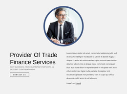
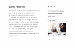
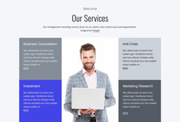
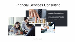
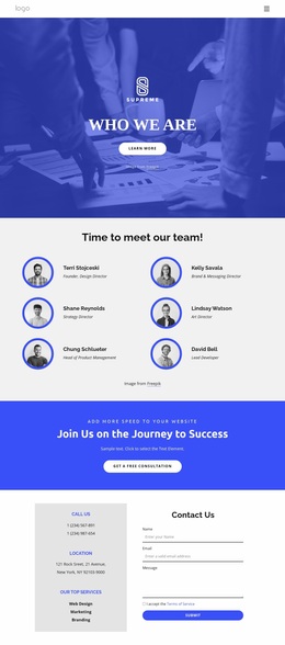
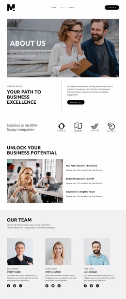
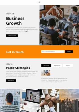
Professional business photography is used as a recurring identity element rather than as one isolated image. A large portrait anchors the opening split composition, and additional photographs accompany the Leadership, Innovations, and Coaching panels. The repeated relationship between image and explanatory text gives the capability area a consistent visual grammar while the alternating placement prevents the page from becoming static. The contact area continues that language by pairing a business photograph with contact messaging and an inquiry form.
The expandable university topic list adds a compact interactive-looking pattern within the broader visual system, and the blue Get to know today! strip creates a clear color emphasis before the closing section. Social links and a dark footer extend the identity into supporting site elements. Together, the palette, typography, photography, spacing, and repeated image-text motif communicate a consulting-oriented design language that can guide related pages while remaining recognizable as one coherent website design.
Customize with Nicepage
Open this ready-made template in the Website Design Builder and customize it visually in the Nicepage editor. Replace demo content, edit page sections, and adapt the design to your project without rebuilding the template from scratch.
Create a Consistent Design Across the Website
Define a Site-Wide Visual Style
Use Theme Settings to establish the visual foundation of the website across its pages and sections. Set global Colors, Fonts, and Typography so the site follows the same design direction instead of styling each page independently.
Coordinate Colors and Typography
Choose a color scheme and font combination that fit the character of the website, then fine-tune Headings H1-H6, regular Text, links, buttons, quotes, lists, and other typography styles. Consistent use of these settings helps create a clear visual hierarchy and keeps recurring design elements recognizable throughout the website.
Add Motion and Interaction
Use Animation Effects to make the website design more dynamic and interactive. Elements and Containers can use effects such as Run On Display, Animation On Hover, and Animation Sync With Scroll to introduce content as visitors move through the site or respond to user interaction. Animation Presets provide ready-made effects that can be adapted to the visual style of the website.
Keep the Website Visually Consistent
Apply the same design direction to shared website elements such as the Header, Menu, and Footer. The Theme Settings Panel brings common site-wide styling controls together, making it easier to maintain a coordinated look as the website expands across multiple pages.
This workflow makes the template a useful starting point for creating a website with a consistent visual identity, coordinated colors and typography, shared design rules, and interactive effects across its pages.