Explore the Product Website Design


Edit Template Offline
2. Create new page and search for id 4242958
Edit Template Online
Create Awesome Websites


Free Nicepage Builder
Keywords
Colorful Cards and Centered Type Define the Visual Language
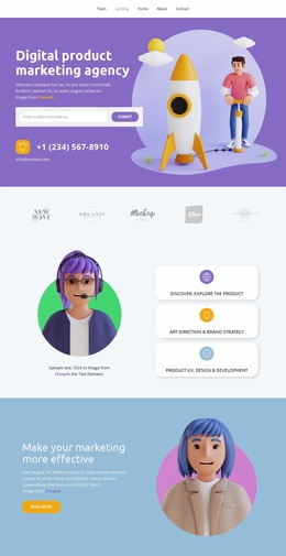
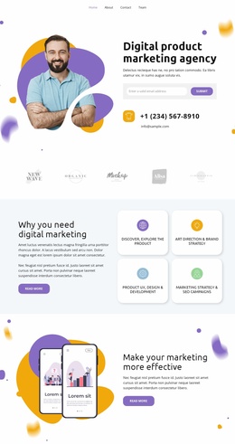
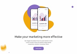
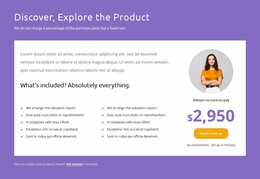
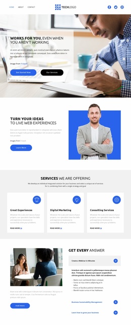
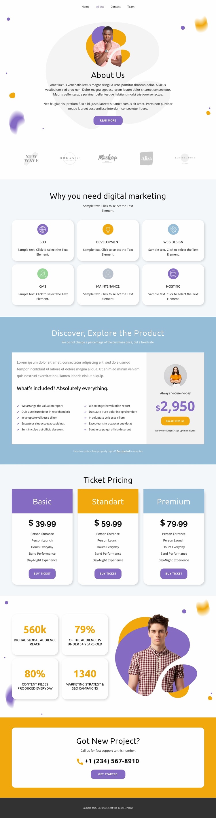
Purple, blue, yellow, and orange accents give the page its strongest visual signature, while light neutral backgrounds keep the colorful details from competing with the content. Rounded white cards repeat across the six digital marketing services and the ticket pricing area, creating a shared surface treatment for information that has different roles. The same visual vocabulary allows SEO, Development, Web design, CMS, Maintenance, and Hosting to feel like parts of one organization rather than unrelated offers.
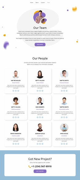
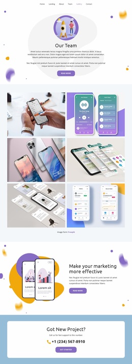
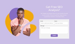
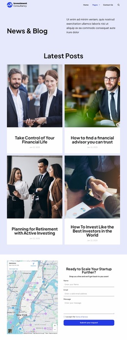
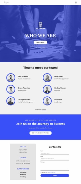
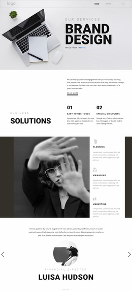
Centered typography controls the page’s tone and alignment. It appears in the About Us introduction, the “Why you need digital marketing” heading, the product offer, and the closing Got New Project? panel. Decorative abstract shapes and illustrative photography soften the more commercial sections, while the five brand marks and the large portrait image introduce recognizable image-led elements. The contrast between open neutral space and compact white cards gives the design a clear balance between atmosphere and information.
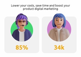
The three ticket packages extend the visual system into a comparison context, and the four metric cards add another repeated unit beside the portrait. Together, these motifs create a design identity that combines promotional color, approachable rounded geometry, centered presentation, and varied imagery. The dark footer supplies a final contrast point, helping the page end with a distinct shared site element rather than blending into the lighter sections.
Customize with Nicepage
Open this ready-made template in the Website Design Builder and customize it visually in the Nicepage editor. Replace demo content, edit page sections, and adapt the design to your project without rebuilding the template from scratch.
Create a Consistent Design Across the Website
Define a Site-Wide Visual Style
Use Theme Settings to establish the visual foundation of the website across its pages and sections. Set global Colors, Fonts, and Typography so the site follows the same design direction instead of styling each page independently.
Coordinate Colors and Typography
Choose a color scheme and font combination that fit the character of the website, then fine-tune Headings H1-H6, regular Text, links, buttons, quotes, lists, and other typography styles. Consistent use of these settings helps create a clear visual hierarchy and keeps recurring design elements recognizable throughout the website.
Add Motion and Interaction
Use Animation Effects to make the website design more dynamic and interactive. Elements and Containers can use effects such as Run On Display, Animation On Hover, and Animation Sync With Scroll to introduce content as visitors move through the site or respond to user interaction. Animation Presets provide ready-made effects that can be adapted to the visual style of the website.
Keep the Website Visually Consistent
Apply the same design direction to shared website elements such as the Header, Menu, and Footer. The Theme Settings Panel brings common site-wide styling controls together, making it easier to maintain a coordinated look as the website expands across multiple pages.
This workflow makes the template a useful starting point for creating a website with a consistent visual identity, coordinated colors and typography, shared design rules, and interactive effects across its pages.