Digital first solutions Website Design


Edit Template Offline
2. Create new page and search for id 16289
Edit Template Online
Create Awesome Websites


Free Nicepage Builder
Keywords
White Type, Green Accents, and Editorial Imagery Define the Direction
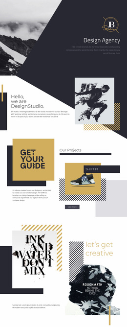
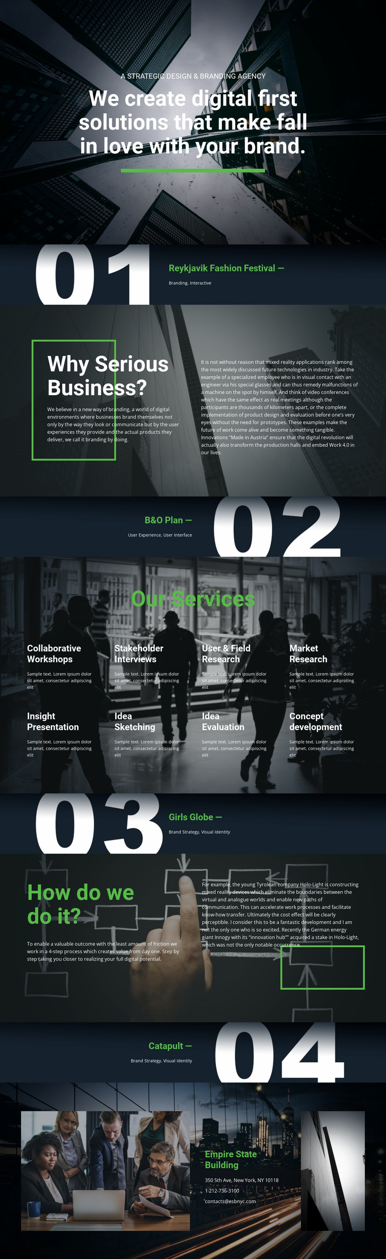
The visual identity is established immediately through the contrast between dark photographic backgrounds and large white typography. The opening positioning statement is centered over an image, while a green accent line provides a restrained but recognizable point of emphasis. That relationship continues through the project showcases, where titles and discipline labels sit directly on full-width imagery rather than inside conventional white cards. Oversized section numerals add an editorial organizing device to the sequence of featured work.
The split sections change the visual rhythm without abandoning the same language. “Why Serious Business?” uses two contrasting text columns, an accent rule, and supporting narrative to give the agency’s philosophy a more deliberate reading space. The services area then compresses eight offerings into two rows over a photographic background, creating a denser pattern after the more open project panels. A similar contrast appears in the process explanation, where a highlighted rule and two-column composition frame the four-step working process. The final contact area places information between two photographic panels, extending the image-led identity to the closing section. Together, these repeated choices make the design feel like an editorial agency presentation rather than a generic corporate service page.
Customize with Nicepage
Open this ready-made template in the Website Design Builder and customize it visually in the Nicepage editor. Replace demo content, edit page sections, and adapt the design to your project without rebuilding the template from scratch.
Create a Consistent Design Across the Website
Define a Site-Wide Visual Style
Use Theme Settings to establish the visual foundation of the website across its pages and sections. Set global Colors, Fonts, and Typography so the site follows the same design direction instead of styling each page independently.
Coordinate Colors and Typography
Choose a color scheme and font combination that fit the character of the website, then fine-tune Headings H1-H6, regular Text, links, buttons, quotes, lists, and other typography styles. Consistent use of these settings helps create a clear visual hierarchy and keeps recurring design elements recognizable throughout the website.
Add Motion and Interaction
Use Animation Effects to make the website design more dynamic and interactive. Elements and Containers can use effects such as Run On Display, Animation On Hover, and Animation Sync With Scroll to introduce content as visitors move through the site or respond to user interaction. Animation Presets provide ready-made effects that can be adapted to the visual style of the website.
Keep the Website Visually Consistent
Apply the same design direction to shared website elements such as the Header, Menu, and Footer. The Theme Settings Panel brings common site-wide styling controls together, making it easier to maintain a coordinated look as the website expands across multiple pages.
This workflow makes the template a useful starting point for creating a website with a consistent visual identity, coordinated colors and typography, shared design rules, and interactive effects across its pages.