Evidence-based medicine Website Design


Edit Template Offline
2. Create new page and search for id 1097414
Edit Template Online
Create Awesome Websites


Free Nicepage Builder
Keywords
Aqua Surfaces and Clinical Photography Establish a Unified Care Identity
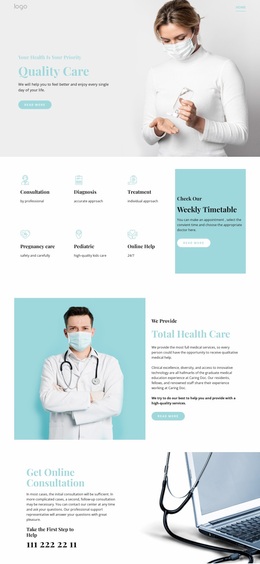
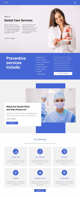
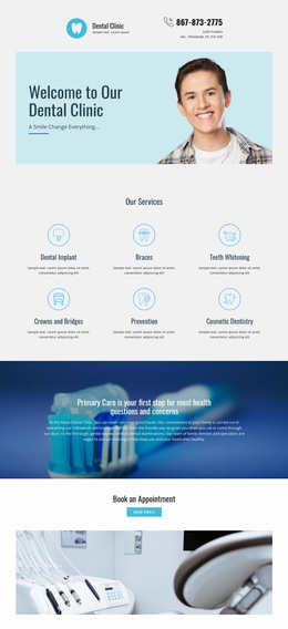
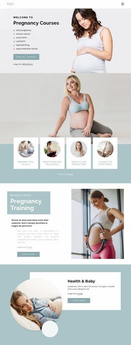
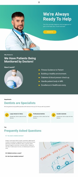
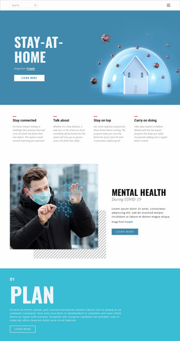
The visual language begins with the relationship between medical photography and restrained color. The Patient Services hero places a white text panel over a medical desk image, allowing the healthcare subject to appear immediately while maintaining readable contrast. Later clinician photographs continue that association in the preventive-services and Direct Primary Care sections, so imagery connects different offerings without requiring identical layouts.
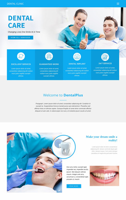
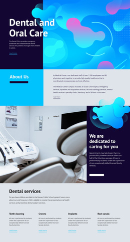
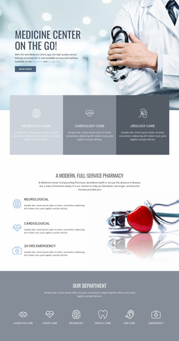
The light aqua and white surfaces provide the main visual field for information. Six pale service cards make Family Care, Urgent Care, Pediatric care, Lab Services, Surgery, and Palliative care feel like related parts of one system. Teal becomes a stronger emphasis color in the Direct Primary Care panel, while the dark footer creates a controlled closing contrast. Dental imagery adds a more specialized visual note, but its three image-and-text tiles remain aligned with the broader medical character.
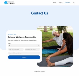
Clean sans-serif typography and generous separation keep the page from feeling crowded despite its wide service coverage. Social links, Book Appointment actions, the contact form, and map are treated as parts of the same visual environment rather than unrelated interface additions. These repeated choices give the design a recognizable identity that could guide related healthcare pages. Nicepage's Theme Settings can support consistent colors and typography across a wider site, but the core character is already visible in this template's palette, photography, surfaces, and spacing.
Customize with Nicepage
Open this ready-made template in the Website Design Builder and customize it visually in the Nicepage editor. Replace demo content, edit page sections, and adapt the design to your project without rebuilding the template from scratch.
Create a Consistent Design Across the Website
Define a Site-Wide Visual Style
Use Theme Settings to establish the visual foundation of the website across its pages and sections. Set global Colors, Fonts, and Typography so the site follows the same design direction instead of styling each page independently.
Coordinate Colors and Typography
Choose a color scheme and font combination that fit the character of the website, then fine-tune Headings H1-H6, regular Text, links, buttons, quotes, lists, and other typography styles. Consistent use of these settings helps create a clear visual hierarchy and keeps recurring design elements recognizable throughout the website.
Add Motion and Interaction
Use Animation Effects to make the website design more dynamic and interactive. Elements and Containers can use effects such as Run On Display, Animation On Hover, and Animation Sync With Scroll to introduce content as visitors move through the site or respond to user interaction. Animation Presets provide ready-made effects that can be adapted to the visual style of the website.
Keep the Website Visually Consistent
Apply the same design direction to shared website elements such as the Header, Menu, and Footer. The Theme Settings Panel brings common site-wide styling controls together, making it easier to maintain a coordinated look as the website expands across multiple pages.
This workflow makes the template a useful starting point for creating a website with a consistent visual identity, coordinated colors and typography, shared design rules, and interactive effects across its pages.