Mental Health During COVID-19 Website Mockup


Review the Split Image and Text Balance at Narrower Widths
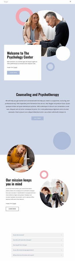
The block’s main visual dependency is its split composition. A single medical-themed photograph, framed by three overlapping geometric shapes, carries substantial visual weight on the left, while the “Mental Health” heading, “During COVID-19” subheading, supporting paragraph, and learn-more button form a narrower information group on the right. In a website mockup, these regions should be reviewed together rather than judged as isolated image and text elements.
At reduced screen widths, the important question is how the image composition and text column adapt their relationship. The photograph and geometric layers need enough space to remain legible as a unified visual area, while the orange display heading and italic subheading need room to wrap without overwhelming the paragraph or button. If the two sides move toward a stacked presentation, the order and spacing between the visual introduction and the topic text become especially important. The white background can help preserve separation, but excessive vertical gaps could weaken the compact hero rhythm.
A mockup review should also check whether the learn-more button remains visually connected to the supporting copy and whether the overlapping shapes retain their intended contrast against the background. The block is static, so the review centers on scale, wrapping, alignment, and stacking rather than slide timing or changing panels. These checks help evaluate the section’s presentation as one responsive unit inside the surrounding page.
Customize with Nicepage
Open this ready-made template in the Website Mockup Builder and customize it visually in the Nicepage editor. Replace demo content, edit page sections, and adapt the design to your project without rebuilding the template from scratch.
Edit Template Offline
2. Create a new page or select existing
3. Click Add new block, search for id 74351 and click enter
Edit Template Online
Create Awesome Websites


Free Nicepage Builder
Keywords
Review This Block as Part of a Responsive Website Mockup
Check the Section Across Devices
Use Responsive Modes to inspect how the block appears on Large Screens, Desktops, Laptops, Tablets, and Phones. Focus on the relationships that matter inside the section: column stacking, image scale, text wrapping, card density, spacing, form width, and alignment.
Adapt the Block for Narrower Screens
Nicepage provides responsive web design tools for adjusting individual device views. Refine sizes and positions, adapt Grids, Lists, and Galleries, and hide selected Elements or Blocks on particular screen sizes when the broader page requires it.
Preview the Section Without Editing Controls
Use Live Page / Preview to evaluate the design with editor controls removed. Review the block in the context of the surrounding page rather than treating one desktop screenshot as proof of all responsive states.
This workflow makes the block one responsive unit within a website mockup, with visual review focused on the section's own content relationships and how they adapt across screen widths.