We are a full service web design agency Website Mockup


Check the Overlap and Text Card at Narrower Widths
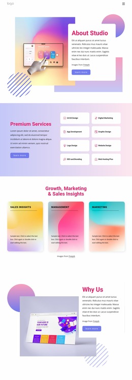
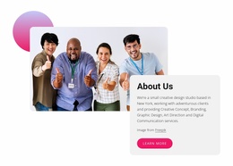
The block’s visual balance depends on the relationship between the large rounded photograph and the white text card placed over its lower-right portion. In a website mockup, that overlap deserves close review at different widths: the card must continue to cover the intended part of the image, while the photograph should retain enough visible area to communicate the brainstorming scene. Excessive compression could weaken the distinction between the visual context and the written About Studio content.
The card also carries several content layers: the heading, New York description, five named offerings, attribution line, and “learn more” button. At narrower widths, check how the paragraph wraps, whether the offering names remain readable, and whether the button still has adequate space beneath the copy. The pink heading, dark text, and purple button should preserve their contrast without forcing the card into an unnecessarily tall or crowded shape.
The three gradient decorative shapes add visual weight around the composition, so their spacing and relative position should be reviewed alongside the image and card. Nicepage’s Responsive Modes can support this visual inspection across screen sizes, while the goal remains evaluating this section’s own relationships within the broader website presentation.
Customize with Nicepage
Open this ready-made template in the Website Mockup Builder and customize it visually in the Nicepage editor. Replace demo content, edit page sections, and adapt the design to your project without rebuilding the template from scratch.
Edit Template Offline
2. Create a new page or select existing
3. Click Add new block, search for id 6229771 and click enter
Edit Template Online
Create Awesome Websites


Free Nicepage Builder
Keywords
Review This Block as Part of a Responsive Website Mockup
Check the Section Across Devices
Use Responsive Modes to inspect how the block appears on Large Screens, Desktops, Laptops, Tablets, and Phones. Focus on the relationships that matter inside the section: column stacking, image scale, text wrapping, card density, spacing, form width, and alignment.
Adapt the Block for Narrower Screens
Nicepage provides responsive web design tools for adjusting individual device views. Refine sizes and positions, adapt Grids, Lists, and Galleries, and hide selected Elements or Blocks on particular screen sizes when the broader page requires it.
Preview the Section Without Editing Controls
Use Live Page / Preview to evaluate the design with editor controls removed. Review the block in the context of the surrounding page rather than treating one desktop screenshot as proof of all responsive states.
This workflow makes the block one responsive unit within a website mockup, with visual review focused on the section's own content relationships and how they adapt across screen widths.