Most frequent cases Website Mockup


The Expanded Panel Is the Key Responsive Review Point
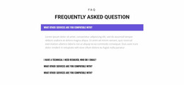
The block’s responsive presentation depends less on horizontal columns than on the changing height and density of its vertical accordion. The centered heading should remain visually connected to the four topic rows, while each circular plus icon should stay aligned with its corresponding label as the available width changes. The white rows and thin borders need to preserve clear separation against the light gray section background, even when topic text wraps onto additional lines.
The open “Create a Webinar in Minutes” item deserves particular attention in a website mockup review. Its one paragraph and four bullet points make the active panel substantially deeper than the three collapsed topics. At narrower widths, wrapped text can increase that height further, affecting the spacing between the active area and the rows below. The pale blue active treatment should continue to identify the open topic without overpowering the centered heading or making the remaining controls disappear visually. Review the compact black text for readable line lengths, check that the plus icons remain easy to associate with their labels, and compare the vertical rhythm of collapsed and expanded states. The main question is whether the same four-topic hierarchy remains balanced and scannable across the presented screen sizes.
Customize with Nicepage
Open this ready-made template in the Website Mockup Builder and customize it visually in the Nicepage editor. Replace demo content, edit page sections, and adapt the design to your project without rebuilding the template from scratch.
Edit Template Offline
2. Create a new page or select existing
3. Click Add new block, search for id 2315091 and click enter
Edit Template Online
Create Awesome Websites


Free Nicepage Builder
Keywords
Review This Block as Part of a Responsive Website Mockup
Check the Section Across Devices
Use Responsive Modes to inspect how the block appears on Large Screens, Desktops, Laptops, Tablets, and Phones. Focus on the relationships that matter inside the section: column stacking, image scale, text wrapping, card density, spacing, form width, and alignment.
Adapt the Block for Narrower Screens
Nicepage provides responsive web design tools for adjusting individual device views. Refine sizes and positions, adapt Grids, Lists, and Galleries, and hide selected Elements or Blocks on particular screen sizes when the broader page requires it.
Preview the Section Without Editing Controls
Use Live Page / Preview to evaluate the design with editor controls removed. Review the block in the context of the surrounding page rather than treating one desktop screenshot as proof of all responsive states.
This workflow makes the block one responsive unit within a website mockup, with visual review focused on the section's own content relationships and how they adapt across screen widths.