Digitally-native design agency Website Mockup


Review the Card’s Balance Against the Abstract Background
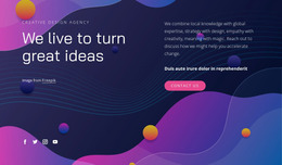
The block depends on a clear visual relationship: a compact rounded white card carries the message on the left, while a full-width abstract image supplies color and scale behind it. On a wide presentation, the purple, pink, blue, and orange gradients can remain visible around the card, preserving the intended contrast between expressive background and restrained content surface. The “Design Studio” label, large magenta heading, and “Learn More” button also need enough room to retain their hierarchy.
At narrower widths, review how the card width changes, how the “Design and Development” heading wraps, and whether the button remains comfortably separated from the attribution line. The image should continue to support the content rather than becoming so cropped or compressed that it competes with the text. Generous surrounding space may need particular attention because reducing it too far could make the rounded card feel crowded.
For a Website Mockup evaluation, Responsive Modes can help inspect the same section at different screen widths. The useful review is visual and block-specific: check card placement, heading scale, text wrapping, button visibility, attribution legibility, and the amount of gradient image still visible around the content. This keeps the mockup assessment focused on the actual hero relationships rather than assuming a single desktop view represents every presentation.
Customize with Nicepage
Open this ready-made template in the Website Mockup Builder and customize it visually in the Nicepage editor. Replace demo content, edit page sections, and adapt the design to your project without rebuilding the template from scratch.
Edit Template Offline
2. Create a new page or select existing
3. Click Add new block, search for id 2175972 and click enter
Edit Template Online
Create Awesome Websites


Free Nicepage Builder
Keywords
Preview and Refine This Website Mockup
Review the Design Across Devices
Use Responsive Modes to see how the website design appears on Large Screens, Desktops, Laptops, Tablets, and Phones. Switch between the available views to compare the same layout at different screen widths and review how typography, images, spacing, navigation, and other content adapt to each device.
Adapt the Mockup for Different Screens
Nicepage provides responsive web design tools for adjusting individual device views when the initial layout needs refinement. You can customize Mobile Views separately, change element sizes and positions, adapt Grids, Lists, and Galleries, and hide selected Elements or Blocks on particular screen sizes. This makes it possible to develop a responsive website mockup instead of evaluating the design at only one fixed desktop size.
Preview the Website Without Editing Controls
Use Live Page / Preview to review the design with the editing interface removed from view. Instant Preview can hide the Page Navigator, Property Panel, selections, and frames, making it easier to evaluate the overall presentation, content hierarchy, and responsive layout as a visitor would see them.
This workflow makes the template useful as a responsive website mockup for visualizing, comparing, and refining how the same website design will appear across different screen sizes.