The best doctors Web Page Design
Edit Template Offline
2. Create new page and search for id 5551782
Edit Template Online
Create Awesome Websites


Free Nicepage Builder
Keywords
The Image-Led Opening Gives Way to a Practical Split Composition
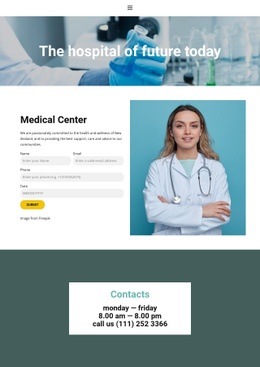
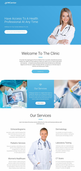
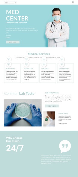
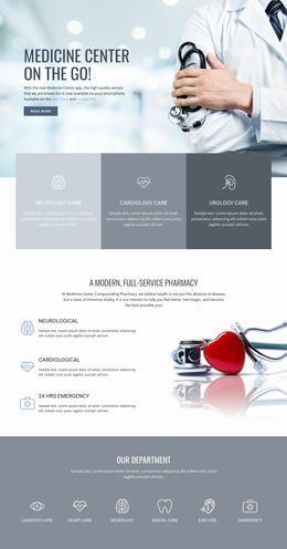
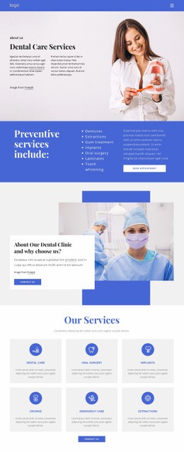
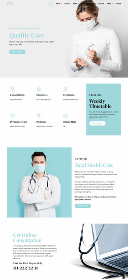
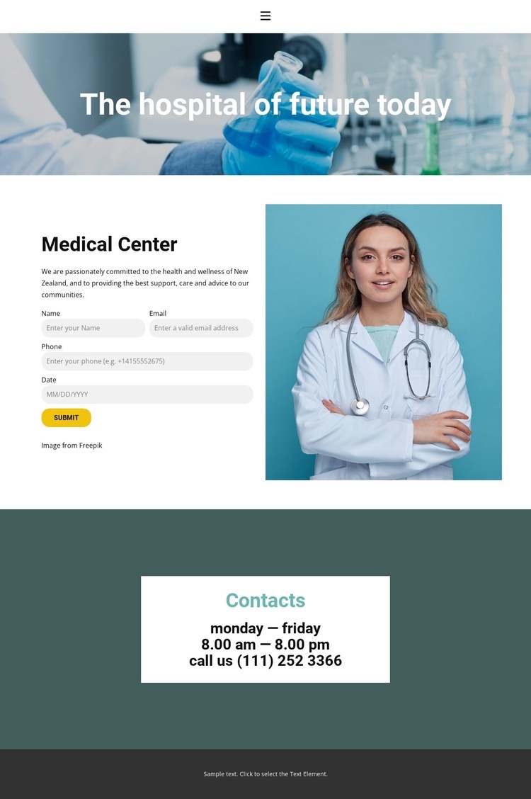
The page establishes its visual hierarchy through changing composition rather than through a long sequence of similar blocks. The first section uses a full-width medical image with a centered headline, allowing the healthcare message to occupy the entire opening field. The following split layout narrows the focus: medical center information sits alongside the calendar-based booking interface, so explanatory content and appointment interaction can be understood together without occupying the same visual column.
The transition into the Contacts section changes both density and contrast. A centered white card holds the Contacts heading, weekday opening hours, and telephone details, while the surrounding dark teal area creates a strong frame. This gives the lower section a clear compositional identity and prevents the practical contact information from competing with the booking interface above it. The compact charcoal footer provides a quiet endpoint, while navigation and mobile navigation support the page’s broader access structure.
As a single web page composition, the design works through a sequence of visual scales: full-width image, two-column information and interaction, centered contact card, then a narrow footer line. Generous spacing keeps the medical information readable, and the cool blue and teal palette connects the transitions. The page’s composition is therefore defined by placement, contrast, and section rhythm rather than by unsupported assumptions about a larger website architecture.
Customize with Nicepage
Open this ready-made template in the Web Page Design Builder and customize it visually in the Nicepage editor. Replace demo content, edit page sections, and adapt the design to your project without rebuilding the template from scratch.
Design a Web Page Section by Section
Choose a Design for Each Section
Build the page from individual content sections instead of starting with a fixed full-page layout. Use Block Designs to browse ready-made sections for different purposes, including introductions, services, galleries, testimonials, contact forms, pricing, and other common parts of a web page. Search or filter the available designs to find a layout that fits the content you want to add.
Combine Blocks and Page Elements
Add selected Blocks to the page and arrange them in the order that supports the page's purpose. A hero section can introduce the main message, followed by services, benefits, portfolio content, testimonials, calls to action, or contact information.
Inside each section, use Web Page Elements such as Text, Image, Hyperlink, Grid, Gallery, and other elements to build and present the page content. Individual elements can be added and adjusted within the Blocks, giving you more control over the composition of each section without having to create the complete layout from scratch.
Refine the Page Layout and Flow
After assembling the main sections, adjust their content, spacing, backgrounds, images, typography, and element placement in the Nicepage editor. Reorder Blocks when necessary and refine the transition from one section to the next so the information hierarchy and visual flow remain clear throughout the page.
This workflow makes the template useful as a web page design that can be composed from ready-made sections, customized with individual page elements, rearranged, and adapted to the content and purpose of an individual page.