Pace Of Change Web Page Design


Edit Template Offline
2. Create new page and search for id 4945615
Edit Template Online
Create Awesome Websites


Free Nicepage Builder
Keywords
Alternating Gallery Layouts Give Each Project Its Own Visual Weight
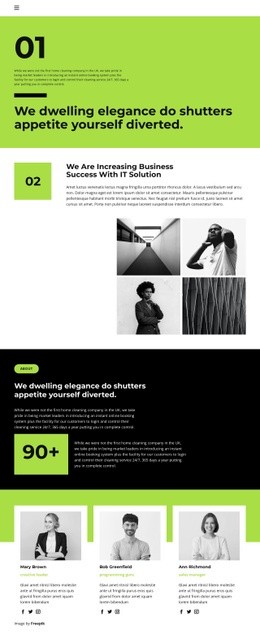
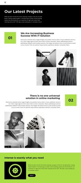
The page composition depends on a repeated relationship rather than a single isolated feature. Each numbered project section places explanatory text beside a four-image monochrome gallery, giving written context and visual evidence comparable space in the presentation. The first gallery introduces the format, the second shifts the heading and description toward the opposite side, and the third returns to the established project treatment. These changes in alignment keep the three showcases related without making the page feel like one duplicated block repeated three times.
The dark “Our Latest Projects” banner provides a high-contrast opening field for the page heading and introductory paragraph. After the image-led sections, the bright lime-green statement band changes both color and content density. Its dark icon panel, short explanatory text, and About link create a compact pause before the final subscription area. That final band uses the same bright accent language but applies it to a different task: presenting the invitation for new articles, videos, and event information alongside name and email controls.
This composition creates a readable information flow from overview to project evidence, then from supporting company context to audience response. Generous white space prevents the four-image galleries from becoming visually crowded, while the black, white, and lime-green palette marks transitions between major regions. The result is a single page whose hierarchy is communicated through placement, contrast, image density, and section rhythm rather than through a flat list of components.
Customize with Nicepage
Open this ready-made template in the Web Page Design Builder and customize it visually in the Nicepage editor. Replace demo content, edit page sections, and adapt the design to your project without rebuilding the template from scratch.
Design a Web Page Section by Section
Choose a Design for Each Section
Build the page from individual content sections instead of starting with a fixed full-page layout. Use Block Designs to browse ready-made sections for different purposes, including introductions, services, galleries, testimonials, contact forms, pricing, and other common parts of a web page. Search or filter the available designs to find a layout that fits the content you want to add.
Combine Blocks and Page Elements
Add selected Blocks to the page and arrange them in the order that supports the page's purpose. A hero section can introduce the main message, followed by services, benefits, portfolio content, testimonials, calls to action, or contact information.
Inside each section, use Web Page Elements such as Text, Image, Hyperlink, Grid, Gallery, and other elements to build and present the page content. Individual elements can be added and adjusted within the Blocks, giving you more control over the composition of each section without having to create the complete layout from scratch.
Refine the Page Layout and Flow
After assembling the main sections, adjust their content, spacing, backgrounds, images, typography, and element placement in the Nicepage editor. Reorder Blocks when necessary and refine the transition from one section to the next so the information hierarchy and visual flow remain clear throughout the page.
This workflow makes the template useful as a web page design that can be composed from ready-made sections, customized with individual page elements, rearranged, and adapted to the content and purpose of an individual page.