Protect your smile Web Page Design


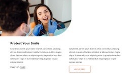
The Upper Image Anchors a Balanced Two-Column Page Composition
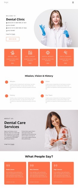
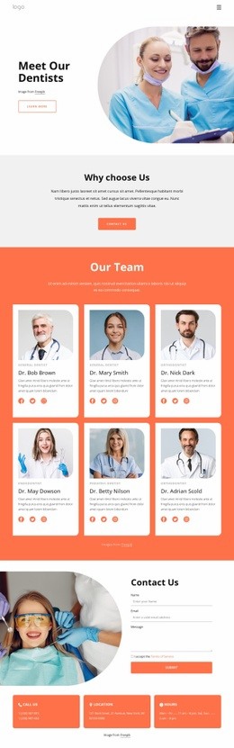
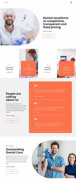
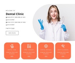
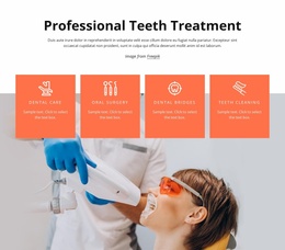
The block’s composition is organized vertically first and horizontally second. A large dental examination photograph spans the upper visual field, giving the section a strong entry point before the content divides into two columns. On the left, the “Protect Your Smile” heading establishes hierarchy alongside supporting text; on the right, another paragraph and the Learn more button create a complementary information-and-action area. This arrangement keeps the image visually prominent while preventing the written content from collapsing into a single dense column.
As one section in web page design, the block can provide a deliberate change of rhythm between neighboring areas. The image offers broad visual weight, and the two-column region below introduces a more measured reading pace. The button remains part of the right-side composition, so it supports the information rather than floating as an isolated page-level CTA. The surrounding page can place other sections before or after this unit while preserving its internal balance.
The white background and generous whitespace are important to the composition because they separate the photograph from the text and maintain room around the heading and paragraphs. Black typography gives the left and right columns comparable visual authority, while the muted peach outline adds a small directional cue. The rounded lower-right image corner breaks the rectangular image edge and helps the upper region transition into the cleaner text layout below. Since the interaction is static, the design depends on placement, contrast, and hierarchy rather than motion.
Customize with Nicepage
Open this ready-made template in the Web Page Design Builder and customize it visually in the Nicepage editor. Replace demo content, edit page sections, and adapt the design to your project without rebuilding the template from scratch.
Edit Template Offline
2. Create a new page or select existing
3. Click Add new block, search for id 2773981 and click enter
Edit Template Online
Create Awesome Websites


Free Nicepage Builder
Keywords
Design a Web Page Section by Section
Choose a Design for Each Section
Build the page from individual content sections instead of starting with a fixed full-page layout. Use Block Designs to browse ready-made sections for different purposes, including introductions, services, galleries, testimonials, contact forms, pricing, and other common parts of a web page. Search or filter the available designs to find a layout that fits the content you want to add.
Combine Blocks and Page Elements
Add selected Blocks to the page and arrange them in the order that supports the page's purpose. A hero section can introduce the main message, followed by services, benefits, portfolio content, testimonials, calls to action, or contact information.
Inside each section, use Web Page Elements such as Text, Image, Hyperlink, Grid, Gallery, and other elements to build and present the page content. Individual elements can be added and adjusted within the Blocks, giving you more control over the composition of each section without having to create the complete layout from scratch.
Refine the Page Layout and Flow
After assembling the main sections, adjust their content, spacing, backgrounds, images, typography, and element placement in the Nicepage editor. Reorder Blocks when necessary and refine the transition from one section to the next so the information hierarchy and visual flow remain clear throughout the page.
This workflow makes the template useful as a web page design that can be composed from ready-made sections, customized with individual page elements, rearranged, and adapted to the content and purpose of an individual page.