Bulletproof Apps Web Page Design


Edit Template Offline
2. Create new page and search for id 12521
Edit Template Online
Create Awesome Websites


Free Nicepage Builder
Keywords
Alternating panels and imagery shape the page’s information rhythm
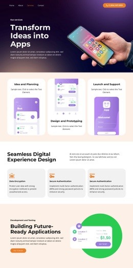
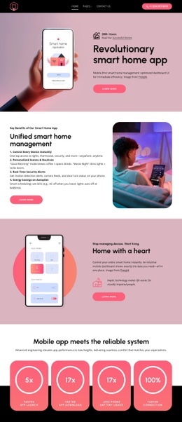
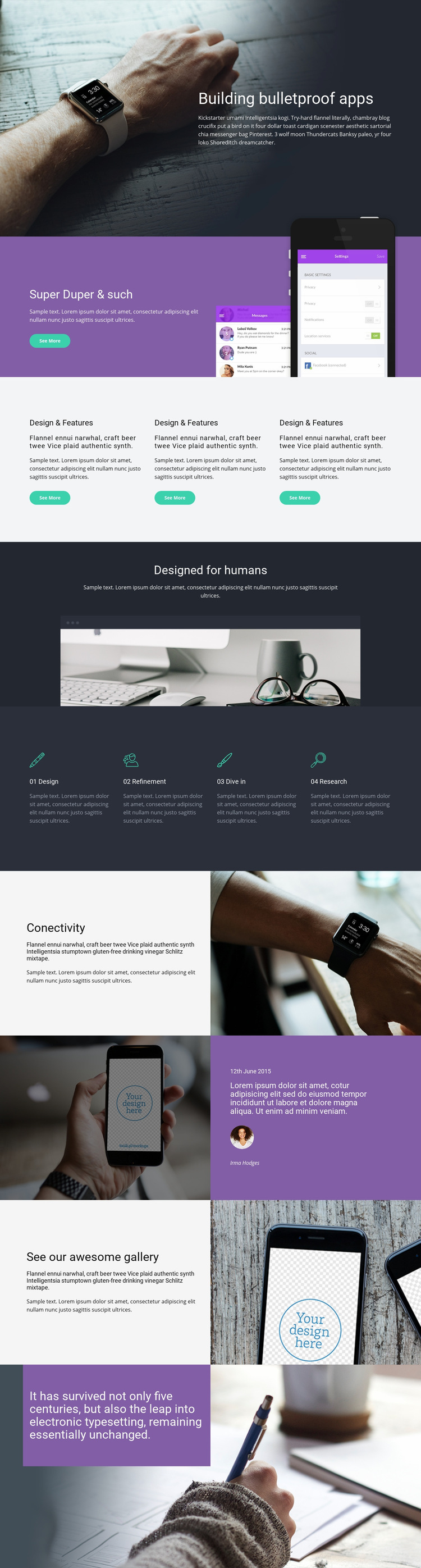
The composition changes visual density from section to section rather than presenting every message in the same format. The opening hero places concise copy beside a large lifestyle photograph under a dark overlay, creating a strong introduction. The next split section reverses the balance by giving the purple text panel a clear visual weight beside overlapping mobile app screens. This establishes the product subject before the page moves into smaller repeated content.
The three feature cards compress information into a horizontal group, while the centered Designed for humans statement creates breathing room above a wide workspace photograph. That transition from compact cards to an open image-led section separates feature explanation from the broader design perspective. The four capability items then restore a regular rhythm through evenly spaced labels and descriptions, making the service process easy to scan without overwhelming the page.
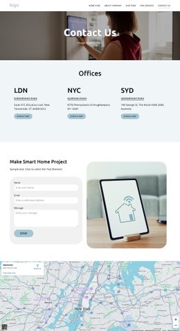
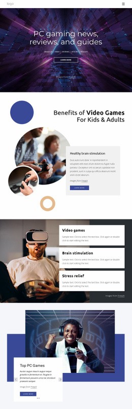
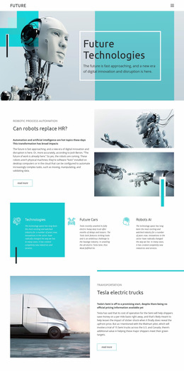
Later split sections use Connectivity and phone imagery to reintroduce focused product storytelling, followed by a gallery-oriented composition with interface imagery and supporting text. The final purple statement over an editorial photograph provides a clear visual conclusion. These changes in alignment, scale, color, and image-to-text balance explain how the single page presents a hierarchy: introduction, showcase, capabilities, perspective, product examples, gallery, and closing response.
Customize with Nicepage
Open this ready-made template in the Web Page Design Builder and customize it visually in the Nicepage editor. Replace demo content, edit page sections, and adapt the design to your project without rebuilding the template from scratch.
Design a Web Page Section by Section
Choose a Design for Each Section
Build the page from individual content sections instead of starting with a fixed full-page layout. Use Block Designs to browse ready-made sections for different purposes, including introductions, services, galleries, testimonials, contact forms, pricing, and other common parts of a web page. Search or filter the available designs to find a layout that fits the content you want to add.
Combine Blocks and Page Elements
Add selected Blocks to the page and arrange them in the order that supports the page's purpose. A hero section can introduce the main message, followed by services, benefits, portfolio content, testimonials, calls to action, or contact information.
Inside each section, use Web Page Elements such as Text, Image, Hyperlink, Grid, Gallery, and other elements to build and present the page content. Individual elements can be added and adjusted within the Blocks, giving you more control over the composition of each section without having to create the complete layout from scratch.
Refine the Page Layout and Flow
After assembling the main sections, adjust their content, spacing, backgrounds, images, typography, and element placement in the Nicepage editor. Reorder Blocks when necessary and refine the transition from one section to the next so the information hierarchy and visual flow remain clear throughout the page.
This workflow makes the template useful as a web page design that can be composed from ready-made sections, customized with individual page elements, rearranged, and adapted to the content and purpose of an individual page.