Business and premium plans One Page Template


A four-card pricing destination separates plan comparison from neighboring content
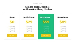
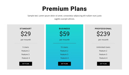
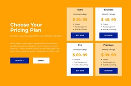
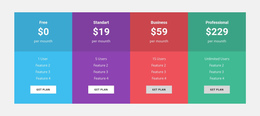
The repeated plan structure gives this block a recognizable role in a continuous page. Visitors can arrive at the pricing section and understand its purpose immediately: Starter, Business, Premium, and Ultimate are shown as four parallel choices, each with a monthly price, a billing label, three included items, and a Get Plan action. The consistent vertical order makes the section feel like one information destination rather than four unrelated panels.
Its visual treatment reinforces that separation. The four equal-width cards create a broad, self-contained row, while centered typography and regular spacing produce a stable rhythm within the page flow. Premium uses a light surface, distinguishing it from the three dark translucent cards without breaking the shared comparison pattern. Cyan accents and the dark atmospheric background can help the pricing area retain its own visual identity between neighboring sections.
Within a one-page project, this block could follow introductory or service information and precede testimonials, contact content, or another closing section. The Get Plan actions may provide onward destinations, but the block should be understood primarily as a pricing and selection destination rather than as proof of existing anchor navigation. Its contribution is the plan comparison itself: a clearly bounded content area that visitors can recognize while moving through a longer continuous page.
Customize with Nicepage
Open this ready-made template in the One Page Template Builder and customize it visually in the Nicepage editor. Replace demo content, edit page sections, and adapt the design to your project without rebuilding the template from scratch.
Edit Template Offline
2. Create a new page or select existing
3. Click Add new block, search for id 87800 and click enter
Edit Template Online
Create Awesome Websites


Free Nicepage Builder
Keywords
Build a Navigable One-Page Website
Connect the Menu to Page Sections
Organize the website as a sequence of sections on a single page and use the Menu For One-Page Site to connect menu items with individual page Blocks. Visitors can jump directly to sections such as About, Services, Testimonials, or Contact without opening separate pages.
Keep the Website on One URL
A one-page template can combine several parts of a small website within one continuous page. Arrange the Header, introduction, services, portfolio, company information, reviews, contact details, and other relevant sections in the order that fits the project while keeping them accessible through the same page navigation.
Make Long Pages Easier to Navigate
For longer one-page websites, keep navigation labels short and connected to meaningful sections so visitors can move through the page without relying only on scrolling. You can also use the Back To Top element to provide a quick way back to the beginning after longer sections.
This workflow makes the template suitable for compact websites that need several distinct content sections while keeping the complete visitor experience on one URL.