Three services of our company Landing Page


Three service cards turn the offer into a scannable benefits stage
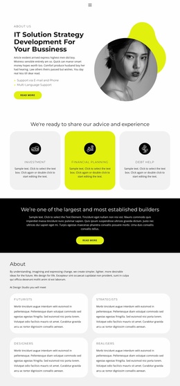
The heading presents advice and experience as the message to absorb before the visitor compares the three service areas. Investment, Financial planning, and Debt help then translate that message into separate benefit categories, each supported by an icon, title, and explanatory text. This gives the landing-page sequence a useful information stage: visitors can understand the range of help before reaching a more focused response element elsewhere.
The single horizontal row makes the three offerings comparable at a glance. Bright green cards on the left and right frame the vivid yellow center card, creating visual rhythm without assigning a confirmed priority or action to any one service. Rounded corners soften the strong color treatment, and generous spacing prevents the cards from reading as one dense paragraph. The black line icons provide a repeated visual cue above each title, helping the eye move through the service choices.
Because the block presents services rather than a confirmed form, purchase control, or inquiry action, its strongest landing-page role is explanation and consideration. It can introduce the available areas of financial advice before a later CTA, contact section, or other response point carries the primary action. The section therefore supports the decision path through clear benefits and category separation, while its stable three-card structure keeps the message focused rather than competing with the main response.
Customize with Nicepage
Open this ready-made template in the Landing Page Builder and customize it visually in the Nicepage editor. Replace demo content, edit page sections, and adapt the design to your project without rebuilding the template from scratch.
Edit Template Offline
2. Create a new page or select existing
3. Click Add new block, search for id 1522449 and click enter
Edit Template Online
Create Awesome Websites


Free Nicepage Builder
Keywords
Build a Landing Page Around One Conversion Goal
Focus on One Primary Action
Use the landing page to guide visitors toward one measurable response, such as requesting a quote, registering, subscribing, booking a consultation, applying for a service, or submitting an inquiry. Keep the primary call-to-action consistent across the important sections so the headline, supporting content, form, and CTA buttons work toward the same campaign goal instead of competing for attention.
Capture Leads With a Form
Use the Contact Form Element to add a contact, subscription, application, or other conversion form directly to the landing page. Customize the form fields, layout, labels, inputs, and button to collect the information required for your campaign while keeping the form focused on the action you want visitors to complete.
Nicepage also provides several form submission options. Form submissions can be sent to Email, stored as Leads, added to Google Sheets, passed to a custom URL or server endpoint, or used to populate a MailChimp mailing list. This provides practical options for collecting inquiries, registrations, subscriptions, applications, and other campaign responses.
Manage Leads and Campaign Responses
When submissions are stored as Leads, you can use Contact Form Leads to review the information collected through the landing page and use it for follow-up. Keep the form connected to the same offer and primary CTA presented throughout the page so visitors move from the campaign message to a clear conversion action.
This workflow makes the template suitable for landing pages where the offer, content, call-to-action, form, and lead collection process work together toward one defined conversion goal.