Smart living, safe data HTML5 Template


Edit Template Offline
2. Create new page and search for id 6542635
Edit Template Online
Create Awesome Websites


Free Nicepage Builder
Keywords
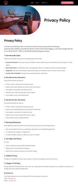
Collection, Rights, and Contact Form a Usable Hierarchy
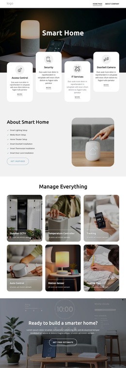
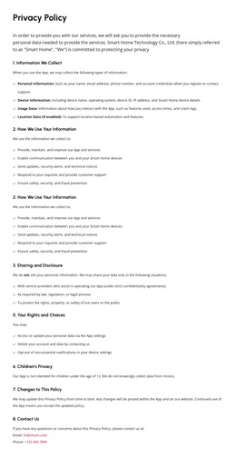
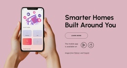
The page hierarchy moves from global access to document identification, then through the policy’s main informational groups. The dark header establishes navigation and contact access before the split introduction identifies the subject with a rounded smart home image and the Privacy Policy heading. The first text block then moves into Information We Collect and How We Use Your Information, with numbered subsections and bullet lists for personal, device, usage, and enabled-location data. The next text block extends the hierarchy with Sharing and Disclosure, Your Rights and Choices, Children’s Privacy, Changes to This Policy, and Contact Us.
These relationships make the page easier to inspect as an organized HTML5 document because each major content purpose has a distinct position in the sequence. The verified policy statements also give the content hierarchy substance: personal information is not sold, users may access or update data, delete an account, and opt out of non-essential notifications, and the app is not intended for children under 13. The final dark footer forms a separate closing region with four text columns for office details, resources, solutions, and support. The resulting organization is more than a visual stack; it establishes a progression from navigation and context to policy detail, user choices, contact access, and shared site resources.
Customize with Nicepage
Open this ready-made template in the HTML5 Template Builder and customize it visually in the Nicepage editor. Replace demo content, edit page sections, and adapt the design to your project without rebuilding the template from scratch.
Explore This HTML5 Template Structure
Navigate the Page Structure
Customize this ready-made HTML5 template visually in the Nicepage editor while keeping its page organization easy to understand. Use the Layers panel to view the hierarchy of the Header, Blocks, Containers, Elements, and Footer, navigate between different parts of the page, and quickly select items within the layout.
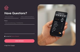
The Layers panel also provides practical controls for working with more complex pages. Blocks, Containers, and Elements can be renamed for easier identification, temporarily hidden while editing, or locked to prevent accidental changes. The outline can also expose the internal structure of elements such as Menus and Contact Forms.
Work With Organized Page Sections
Blocks divide the page into major content sections, while Containers and Elements organize the content inside them. Keeping this hierarchy visible makes it easier to understand how individual parts of the page relate to one another, especially when a layout contains many nested elements.
You can use the Layers panel to move through this structure instead of selecting everything directly on the canvas, making complex layouts easier to inspect and manage as an organized page hierarchy.
Review and Extend the HTML
After customizing the page visually, the resulting HTML can be reviewed and adapted when code-level changes are required. If a project needs additional markup or functionality beyond the standard page elements, use the HTML Element to add targeted custom HTML where necessary.
This workflow combines visual editing with a clear view of the page hierarchy, making the template useful both as a ready-made design and as an HTML5 project whose structure can be inspected, managed, adapted, and extended.

Design Set (23)
-
Free Website Builder SoftwareDownload
-

-
-
-
-
-
-
-
-
-
-
-
-




More from Technology HTML5 Templates
-
Free Website Builder SoftwareDownload