

I buyed the program for designing new web pages but it is still is useless...
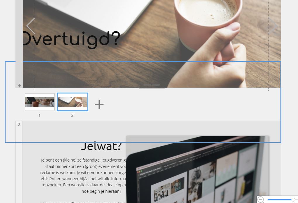
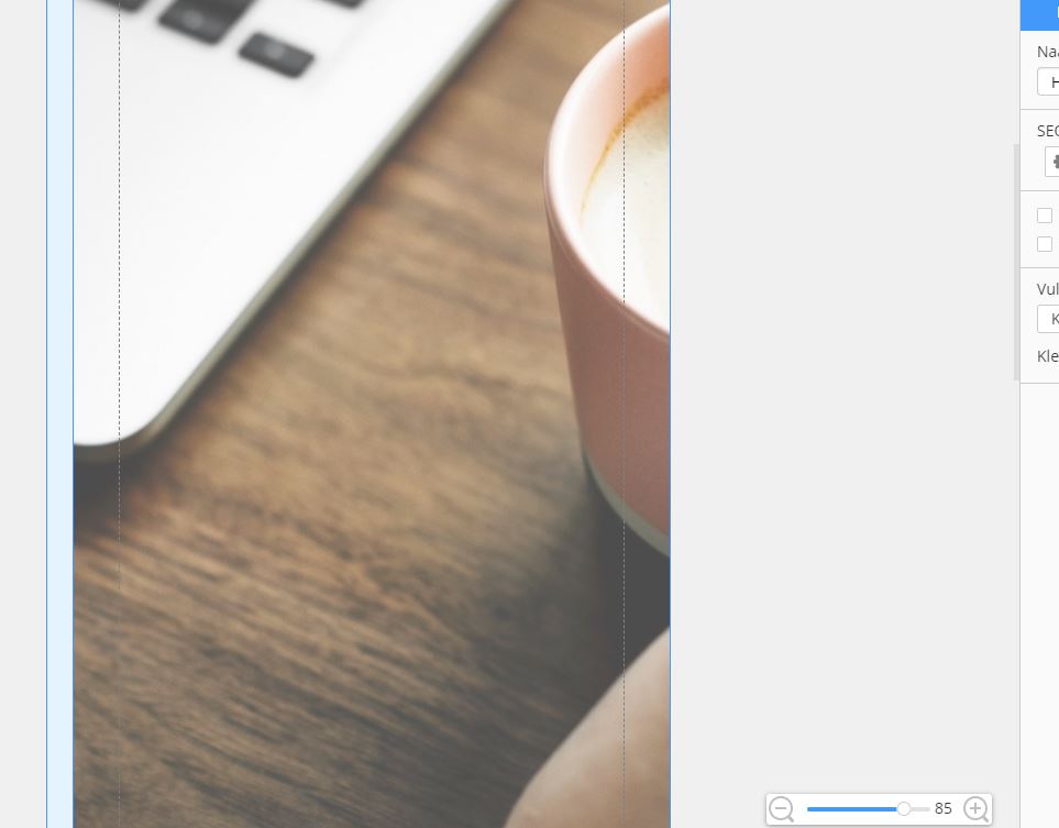
I tried to design a new website for my company. I made all my slides and sections from the home page nice in every view of the responsive mode and installed the website on my server to see how it looks. I was happy and decided to add more pages in my program: but,, there are the problems!
The program decided to make all the responsive views from my homepage to become useless... my font sizes where changed to other ones so it does not fit my pages anymore, my menu disappeared to places outer the sections etc... hours of work for nothing...
On my server everything is still oké: www.jeldesign.be
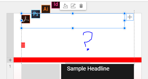
But my saved file on my computer is changed totally so i need to begin again but not gonna do this until this bug is solved!!! The attached files is what it looks now... The program just changed all my work to how it wants it to be... This is really the most useless payment I did for a webdesign program in years!!!! From the moment you start switching to responsive modes the program is total crap at this moment :(


![Andy[taly]](https://www.gravatar.com/avatar/c67f57df62f99d9a29787317c73802b5?s=48&d=identicon "Andy[taly]")
