Our pricing Web Page Design


Centered Plan Stacks Create a Balanced Mid-Page Composition
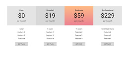
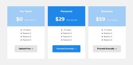
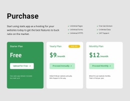
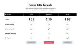
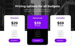
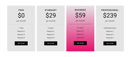
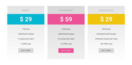
The horizontal row is the primary compositional decision in this section. Three equal-width columns distribute the pricing content across the page, while centered typography keeps each plan visually contained. Within every column, the name, displayed price, feature list, and purchase button form a vertical stack with a consistent rhythm. That alignment lets the eye compare equivalent levels across the row instead of following one long text stream.
The middle panel introduces controlled asymmetry. Its gray gradient surface and blue purchase button give the center more visual weight, while the outer light panels and gray buttons preserve the row's overall balance. Large prices create strong horizontal anchors near the top of the stacks, and the compact lists below them prevent the section from becoming overly dense. The blue background band adds a broad color field behind the upper portion, helping the panels read as one coordinated page section.
As a web page design element, this block can create a decisive transition between explanatory content and later action or support content. Its composition works best when surrounding sections allow the three-column rhythm to remain visible rather than competing with another dense grid. The section supplies a complete visual comparison unit for the page flow, while its spacing, panel contrast, and center emphasis determine how visitors move through the information.
Customize with Nicepage
Open this ready-made template in the Web Page Design Builder and customize it visually in the Nicepage editor. Replace demo content, edit page sections, and adapt the design to your project without rebuilding the template from scratch.
Edit Template Offline
2. Create a new page or select existing
3. Click Add new block, search for id 92933 and click enter
Edit Template Online
Create Awesome Websites


Free Nicepage Builder
Keywords
Design a Web Page Section by Section
Choose a Design for Each Section
Build the page from individual content sections instead of starting with a fixed full-page layout. Use Block Designs to browse ready-made sections for different purposes, including introductions, services, galleries, testimonials, contact forms, pricing, and other common parts of a web page. Search or filter the available designs to find a layout that fits the content you want to add.
Combine Blocks and Page Elements
Add selected Blocks to the page and arrange them in the order that supports the page's purpose. A hero section can introduce the main message, followed by services, benefits, portfolio content, testimonials, calls to action, or contact information.
Inside each section, use Web Page Elements such as Text, Image, Hyperlink, Grid, Gallery, and other elements to build and present the page content. Individual elements can be added and adjusted within the Blocks, giving you more control over the composition of each section without having to create the complete layout from scratch.
Refine the Page Layout and Flow
After assembling the main sections, adjust their content, spacing, backgrounds, images, typography, and element placement in the Nicepage editor. Reorder Blocks when necessary and refine the transition from one section to the next so the information hierarchy and visual flow remain clear throughout the page.
This workflow makes the template useful as a web page design that can be composed from ready-made sections, customized with individual page elements, rearranged, and adapted to the content and purpose of an individual page.