Zara Web Page Design


Edit Template Offline
2. Create new page and search for id 21448
Edit Template Online
Create Awesome Websites


Free Nicepage Builder
Keywords
Split Editorial Sections and Full-Width Features Control the Page Rhythm
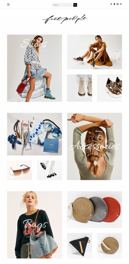
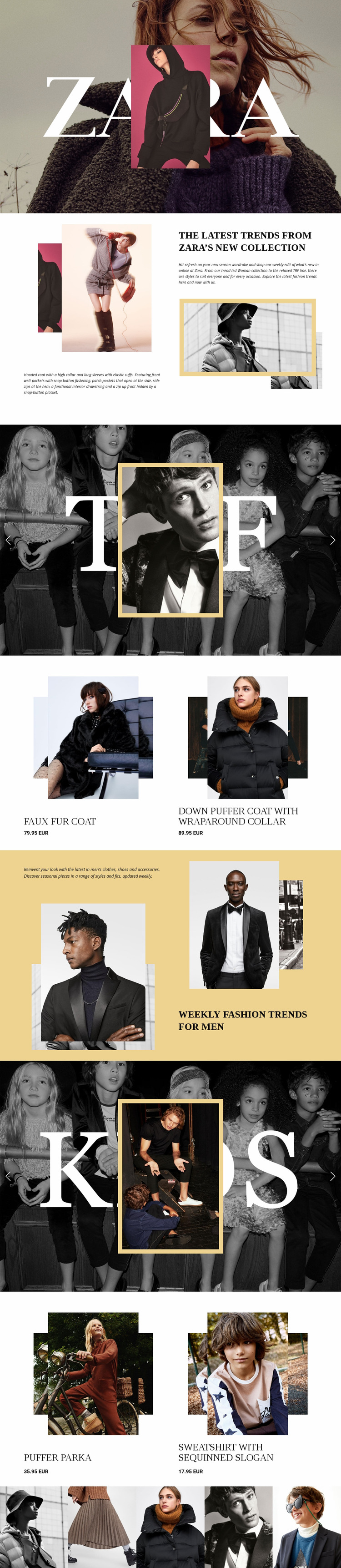
The composition changes its visual density from section to section instead of presenting every fashion category in the same format. The opening hero is image-dominant: a full-width photograph supports the ZARA wordmark while a centered portrait creates layered focus. The following women’s split section narrows the field into stacked product imagery on one side and heading, description, and framed photography on the other. This shift gives the page an editorial pause before the TRF slider expands the visual scale again.
The two-item women’s product area introduces a more compact arrangement, pairing product imagery with names and displayed prices. Later, the men’s section repeats the split principle with layered menswear imagery, while the KIDS slider restores the full-width collection-feature treatment. The children’s product list then creates another compact information point. These transitions between wide image fields, asymmetrical editorial areas, and paired product presentations create the page’s information hierarchy.
The closing gallery simplifies the composition into one horizontal strip of five photographs. It provides visual continuity after the product content without adding another dense text block. As an individual web page, the design works through placement and sequence: brand emphasis comes first, collection explanations follow, products receive focused moments, and the final image strip releases the accumulated density. The visual flow depends on these relationships rather than on a site-wide architecture.
Customize with Nicepage
Open this ready-made template in the Web Page Design Builder and customize it visually in the Nicepage editor. Replace demo content, edit page sections, and adapt the design to your project without rebuilding the template from scratch.
Design a Web Page Section by Section
Choose a Design for Each Section
Build the page from individual content sections instead of starting with a fixed full-page layout. Use Block Designs to browse ready-made sections for different purposes, including introductions, services, galleries, testimonials, contact forms, pricing, and other common parts of a web page. Search or filter the available designs to find a layout that fits the content you want to add.
Combine Blocks and Page Elements
Add selected Blocks to the page and arrange them in the order that supports the page's purpose. A hero section can introduce the main message, followed by services, benefits, portfolio content, testimonials, calls to action, or contact information.
Inside each section, use Web Page Elements such as Text, Image, Hyperlink, Grid, Gallery, and other elements to build and present the page content. Individual elements can be added and adjusted within the Blocks, giving you more control over the composition of each section without having to create the complete layout from scratch.
Refine the Page Layout and Flow
After assembling the main sections, adjust their content, spacing, backgrounds, images, typography, and element placement in the Nicepage editor. Reorder Blocks when necessary and refine the transition from one section to the next so the information hierarchy and visual flow remain clear throughout the page.
This workflow makes the template useful as a web page design that can be composed from ready-made sections, customized with individual page elements, rearranged, and adapted to the content and purpose of an individual page.