Quiksilver Web Page Design


Edit Template Offline
2. Create new page and search for id 17884
Edit Template Online
Create Awesome Websites


Free Nicepage Builder
Keywords
Alternating Image-and-Copy Blocks Shape the Page Rhythm
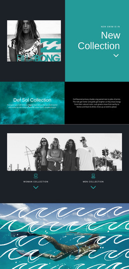
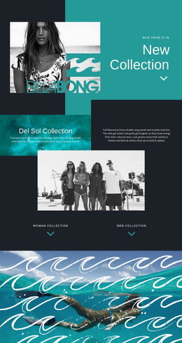
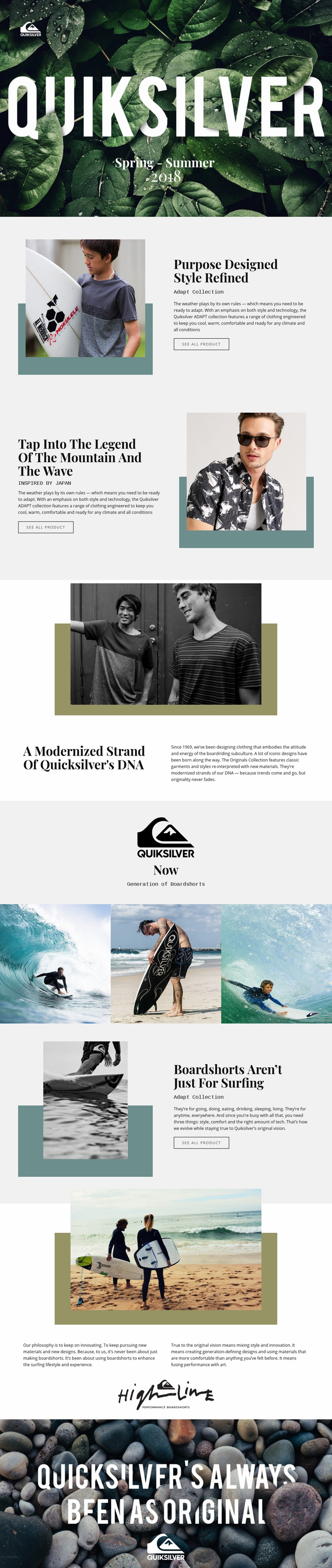
The composition relies on controlled changes in scale, alignment, and visual density. The opening Spring–Summer block uses a full-width nature image with centered white lettering, giving the first message maximum spatial presence. The Adapt Collection then narrows the field into a two-column relationship between product photography and copy. The Japan-inspired section reverses the placement, so the visitor encounters a new directional movement instead of a repeated left-image pattern.
The heritage section expands vertically around a large central image and lower supporting text, while the “Now” milestone uses a quieter neutral background and centered mark. This pause prepares the transition into the three equal-width surfing photographs, where the page becomes denser and more image-led. The boardshorts block returns to a split composition, then the Wide section opens into a large beach photograph, two philosophy statements, and a centered signature-style mark. The final coastal image restores the full-width treatment used at the beginning.
These transitions create the page’s information flow: campaign introduction, collection explanation, inspiration, heritage, lifestyle imagery, product focus, philosophy, and closure. The design works as a web page because each section changes the visitor’s visual position and content emphasis while remaining connected through consistent typography, spacing, and image-led storytelling.
Customize with Nicepage
Open this ready-made template in the Web Page Design Builder and customize it visually in the Nicepage editor. Replace demo content, edit page sections, and adapt the design to your project without rebuilding the template from scratch.
Design a Web Page Section by Section
Choose a Design for Each Section
Build the page from individual content sections instead of starting with a fixed full-page layout. Use Block Designs to browse ready-made sections for different purposes, including introductions, services, galleries, testimonials, contact forms, pricing, and other common parts of a web page. Search or filter the available designs to find a layout that fits the content you want to add.
Combine Blocks and Page Elements
Add selected Blocks to the page and arrange them in the order that supports the page's purpose. A hero section can introduce the main message, followed by services, benefits, portfolio content, testimonials, calls to action, or contact information.
Inside each section, use Web Page Elements such as Text, Image, Hyperlink, Grid, Gallery, and other elements to build and present the page content. Individual elements can be added and adjusted within the Blocks, giving you more control over the composition of each section without having to create the complete layout from scratch.
Refine the Page Layout and Flow
After assembling the main sections, adjust their content, spacing, backgrounds, images, typography, and element placement in the Nicepage editor. Reorder Blocks when necessary and refine the transition from one section to the next so the information hierarchy and visual flow remain clear throughout the page.
This workflow makes the template useful as a web page design that can be composed from ready-made sections, customized with individual page elements, rearranged, and adapted to the content and purpose of an individual page.