Use the Gallery Slider Element to display the Gallery Images as Slides. You can also show Text to describe images. If you want to add other Elements into Slides, please use the Slider Element.
Adding Gallery Slider Element
You can add the Gallery Slider Element from the Add Elements list in the Top Bar.

Gallery Slider in Slider
There is also the Gallery Slider Element available in the Slider section of the Add Menu.

Slider Layout for Gallery
You can select the Slider layout for any of your Galleries and switch between all five Gallery layout types.

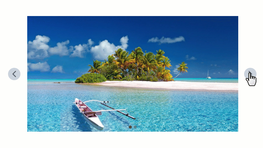
Gallery Slider
Presets
There are Gallery Slider Presets for a start. You can also use other Gallery Presets and compare layouts за the Presets to see the difference and select the most appropriate layout for your needs.

Gallery Slider Options
You can set the Gallery Slider Options similar to other Gallery layouts.

Image Hover Effects
You can apply the Effects on Image Hover.

Text Options
For the Gallery Slider, you can use the Text Style options to add stylize the Text shown on Hover.

Text Hover Effects
You can specify the Hover Effects for the Text in the Text Style Tab of the Property Panel for the Gallery Slider.

Arrow and Indicators
You can stylize the Arrows and Indicators of your Gallery Slider with the properties in the Property Panel.

Gallery Slider in Mobile Views
You can modify the size and position of the Gallery Caption in each Mobile View.
