Black Friday Sale! Save up to 50% off!

Responsive problem

trazdum
10 Posts
trazdum posted this 14 February 2020
Ask a Question

Hello, I have few problem with the mobile view:
1) in some iPhone (SE and 5) there is a sidebar empty, you can see in the attach img
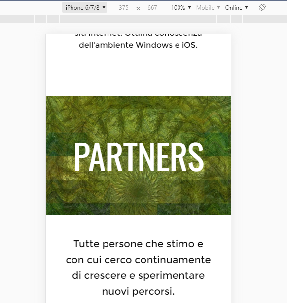
2) there are some title that I center vertically in a box in the administrator view (normal and mobile view) but that isn't centered in mobile view in frontend view (title.jpg)
Thank you

ps: forgot to say that the website is this http://www.cidesign.it

Hello, I have few problem with the mobile view: 1) in some iPhone (SE and 5) there is a sidebar empty, you can see in the attach img 2) there are some title that I center vertically in a box in the administrator view (normal and mobile view) but that isn't centered in mobile view in frontend view (title.jpg) Thank you ps: forgot to say that the website is this http://www.cidesign.it

Last edited 14 February 2020 by trazdum
Vote to pay developers attention to this features or issue.
20 Replies
Order By: Standard | Newest
Support Team
Support Team posted this 17 February 2020

Hi Francesco,

The viewport size of the iPhone SE and 5 is 320px. Nicepage min Sheet width is 360px. Therefore some display problems are possible. As I can see, the title is centered when the screen size is 360px or higher.
Does the issue happen on any modern phone (iPhone 6+)?

...................................................
Sincerely,
Olivia
Nicepage Support Team

Please subscribe to our YouTube channel: http://youtube.com/nicepage?sub_confirmation=1
Follow us on Facebook: http://facebook.com/nicepageapp

Hi Francesco, The viewport size of the iPhone SE and 5 is 320px. Nicepage min Sheet width is 360px. Therefore some display problems are possible. As I can see, the title is centered when the screen size is 360px or higher. Does the issue happen on any modern phone (iPhone 6+)? ................................................... Sincerely, Olivia Nicepage Support Team Please subscribe to our YouTube channel: http://youtube.com/nicepage?sub_confirmation=1 Follow us on Facebook: http://facebook.com/nicepageapp
trazdum
10 Posts
trazdum posted this 17 February 2020

Hi Olivia, thank you for reply. As I can see in the Chrome emulator for iPhone 6+ there are no problem for the lateral problem but still for the vertical alignement of the titles. Thank you

Hi Olivia, thank you for reply. As I can see in the Chrome emulator for iPhone 6+ there are no problem for the lateral problem but still for the vertical alignement of the titles. Thank you
Support Team
Support Team posted this 18 February 2020

Hi Francesco,

Could you please provide a screenshot with an alignment issue from emulator?
This title looks ok on my side:

title-alignment.png

...................................................
Sincerely,
Olivia
Nicepage Support Team

Please subscribe to our YouTube channel: http://youtube.com/nicepage?sub_confirmation=1
Follow us on Facebook: http://facebook.com/nicepageapp

Hi Francesco, Could you please provide a screenshot with an alignment issue from emulator? This title looks ok on my side: !title-alignment.png! ................................................... Sincerely, Olivia Nicepage Support Team Please subscribe to our YouTube channel: http://youtube.com/nicepage?sub_confirmation=1 Follow us on Facebook: http://facebook.com/nicepageapp
trazdum
10 Posts
trazdum posted this 18 February 2020

We applied a solution that fixed both problem. The code is this:

body {
overflow: hidden;
}

@media (max-width: 415px){

.u-section-1 .u-text-1 {

font-size: 4rem;
}
.u-sheet,
.u-section-2 .u-text-1,
.u-section-2 .u-text-2,
.u-section-3 .u-text-1,
.u-section-5 .u-text-1,
.u-section-7 .u-text-1,
.u-section-7 .u-text-2,
.u-footer .u-text-1,

.page-id-74 .u-section-4 .u-text-1,
.page-id-74 .u-section-1 .u-text-1{
width: 300px;

}
.u-section-1 .u-image-1 {
width: 280px;
height: 280px;
}
}

Maybe can help you find your solution.
Have a nice day and thank you for support

We applied a solution that fixed both problem. The code is this: body { overflow: hidden; } @media (max-width: 415px){ .u-section-1 .u-text-1 { font-size: 4rem; } .u-sheet, .u-section-2 .u-text-1, .u-section-2 .u-text-2, .u-section-3 .u-text-1, .u-section-3 .u-text-1, .u-section-5 .u-text-1, .u-section-7 .u-text-1, .u-section-7 .u-text-2, .u-footer .u-text-1, .page-id-74 .u-section-4 .u-text-1, .page-id-74 .u-section-1 .u-text-1{ width: 300px; } .u-section-1 .u-image-1 { width: 280px; height: 280px; } } Maybe can help you find your solution. Have a nice day and thank you for support
Support Team
Support Team posted this 04 March 2020

Francesco,
Thank you, we will consider your proposal, if you have questions, please contact

...................................................
Sincerely,

Nicepage Support Team

Please subscribe to our YouTube channel: http://youtube.com/nicepage?sub_confirmation=1
Follow us on Facebook: http://facebook.com/nicepageapp

Francesco, Thank you, we will consider your proposal, if you have questions, please contact ................................................... Sincerely, Nicepage Support Team Please subscribe to our YouTube channel: http://youtube.com/nicepage?sub_confirmation=1 Follow us on Facebook: http://facebook.com/nicepageapp
trazdum
10 Posts
trazdum posted this 06 March 2020

Ok, thank you for support, see you next bug ;)

Ok, thank you for support, see you next bug ;)
vitalyfrlan
1 Posts
vitalyfrlan posted this 23 September 2020

Hi Francesco,

The viewport size of the iPhone SE and 5 is 320px. Nicepage min Sheet width is 360px. Therefore some display problems are possible. As I can see, the title is centered when the screen size is 360px or higher.
Does the issue happen on any modern phone (iPhone 6+)?

...................................................
Sincerely,
Olivia
Nicepage Support Team

Please subscribe to our YouTube channel: http://youtube.com/nicepage?sub_confirmation=1
Follow us on Facebook: http://facebook.com/nicepageapp

Как поменять минимальную ширину?

> Hi Francesco, > > The viewport size of the iPhone SE and 5 is 320px. Nicepage min Sheet width is 360px. Therefore some display problems are possible. As I can see, the title is centered when the screen size is 360px or higher. > Does the issue happen on any modern phone (iPhone 6+)? > > ................................................... > Sincerely, > Olivia > Nicepage Support Team > > Please subscribe to our YouTube channel: http://youtube.com/nicepage?sub_confirmation=1 > Follow us on Facebook: http://facebook.com/nicepageapp Как поменять минимальную ширину?
Support Team
Support Team posted this 25 September 2020

Vitaly,

It's not yet possible in the UI.

...................................................
Sincerely,
Allen R.
Nicepage Support Team

Please subscribe to our YouTube channel: http://youtube.com/nicepage?sub_confirmation=1
Follow us on Facebook: http://facebook.com/nicepageapp

Vitaly, It's not yet possible in the UI. ................................................... Sincerely, Allen R. Nicepage Support Team Please subscribe to our YouTube channel: http://youtube.com/nicepage?sub_confirmation=1 Follow us on Facebook: http://facebook.com/nicepageapp
dmayne
5 Posts
dmayne posted this 26 December 2020

This is apparently a huge problem not supporting the 320px width. The iphone 6,6s, 7, and 8 have zoom mode layout which one configures on phone setup. How can we tell our viewers that they need to switch their phones to standard mode to view our websites ? When will this get fixed ?

This is apparently a huge problem not supporting the 320px width. The iphone 6,6s, 7, and 8 have zoom mode layout which one configures on phone setup. How can we tell our viewers that they need to switch their phones to standard mode to view our websites ? When will this get fixed ?

Last edited 26 December 2020 by dmayne

Support Team
Support Team posted this 28 December 2020

Hi,

Nicepage min Sheet width is 360px. Therefore devices with a viewport size less than 360px are not supported. Unfortunately, we do not plan to support small screens in the near future.

...................................................
Sincerely,
Olivia
Nicepage Support Team

Please subscribe to our YouTube channel: http://youtube.com/nicepage?sub_confirmation=1
Follow us on Facebook: http://facebook.com/nicepageapp

Hi, Nicepage min Sheet width is 360px. Therefore devices with a viewport size less than 360px are not supported. Unfortunately, we do not plan to support small screens in the near future. ................................................... Sincerely, Olivia Nicepage Support Team Please subscribe to our YouTube channel: http://youtube.com/nicepage?sub_confirmation=1 Follow us on Facebook: http://facebook.com/nicepageapp
dmayne
5 Posts
dmayne posted this 28 December 2020

So you are not going to support displays on up to iphone 12 ?

see https://support.apple.com/guide/iphone/aside/iph077d2b9f5/14.0/ios/14.0

Your web pages says:

Perfect Results On Any Device
Web pages are absolutely mobile-friendly and look perfect in all device views

And

Mobile-Friendly
Build websites that look great on all modern devices.

So the iPhone 12 isn't a modern device ?

So you are not going to support displays on up to iphone 12 ? see https://support.apple.com/guide/iphone/aside/iph077d2b9f5/14.0/ios/14.0 Your web pages says: Perfect Results On Any Device Web pages are absolutely mobile-friendly and look perfect in all device views And Mobile-Friendly Build websites that look great on all modern devices. So the iPhone 12 isn't a modern device ?

Last edited 28 December 2020 by dmayne

pland762
13 Posts
pland762 posted this 28 December 2020

So you are not going to support displays on up to iphone 12 ?

see https://support.apple.com/guide/iphone/aside/iph077d2b9f5/14.0/ios/14.0

Your web pages says:

Perfect Results On Any Device
Web pages are absolutely mobile-friendly and look perfect in all device views

And

Mobile-Friendly
Build websites that look great on all modern devices.

So the iPhone 12 isn't a modern device ?

С адаптивностью столкнулся и я. С делал клиенту сайт. В итоге я не получил денег. Так как на смартфонах сайт не вписывается а приходится двигать в лево и право, причем с лева обрезается текст. Картинки в тексте не в лазят уходят в право. Хотя в редакторе Nicepage все выглядит отлично. И получается так, что на все баги отвечают что они не планируют в ближайшее время изменять не чего. Я уже сколько раз писал изменить в иконках соцсетей вместо googl+ сделать Одноклассники. Но увы. Так же проблема в следующем делаешь анимацию картинки в blog template. Там анимация в редакторе работает, ставишь шаблон на сайт анимация не работает. Так же нет настроек на картинки для мобильных устройств.

> So you are not going to support displays on up to iphone 12 ? > > see https://support.apple.com/guide/iphone/aside/iph077d2b9f5/14.0/ios/14.0 > > Your web pages says: > > Perfect Results On Any Device > Web pages are absolutely mobile-friendly and look perfect in all device views > > And > > Mobile-Friendly > Build websites that look great on all modern devices. > > So the iPhone 12 isn't a modern device ? > > С адаптивностью столкнулся и я. С делал клиенту сайт. В итоге я не получил денег. Так как на смартфонах сайт не вписывается а приходится двигать в лево и право, причем с лева обрезается текст. Картинки в тексте не в лазят уходят в право. Хотя в редакторе Nicepage все выглядит отлично. И получается так, что на все баги отвечают что они не планируют в ближайшее время изменять не чего. Я уже сколько раз писал изменить в иконках соцсетей вместо googl+ сделать Одноклассники. Но увы. Так же проблема в следующем делаешь анимацию картинки в blog template. Там анимация в редакторе работает, ставишь шаблон на сайт анимация не работает. Так же нет настроек на картинки для мобильных устройств.
Support Team
Support Team posted this 06 January 2021

David,

We are working on the issue, and we are going to support other devices.
https://nicepage.com/doc/4011/supported-browsers

Please refer to our tips, and in most cases, the mobile views will be fine automatically.
https://nicepage.com/doc/36215/basic-tips-to-build-responsive-websites

Aleksandr,

We have added your request about the Social Elements to our wish list and have forwarded it to the dev team.

...................................................
Sincerely,
Allen R.
Nicepage Support Team

Please subscribe to our YouTube channel: http://youtube.com/nicepage?sub_confirmation=1
Follow us on Facebook: http://facebook.com/nicepageapp

David, We are working on the issue, and we are going to support other devices. https://nicepage.com/doc/4011/supported-browsers Please refer to our tips, and in most cases, the mobile views will be fine automatically. https://nicepage.com/doc/36215/basic-tips-to-build-responsive-websites Aleksandr, We have added your request about the Social Elements to our wish list and have forwarded it to the dev team. ................................................... Sincerely, Allen R. Nicepage Support Team Please subscribe to our YouTube channel: http://youtube.com/nicepage?sub_confirmation=1 Follow us on Facebook: http://facebook.com/nicepageapp
dmayne
5 Posts
dmayne posted this 09 January 2021

So you are going to support Display Zoom on iPhones Allen (e.g. 320 pixel displays) ? If so, that is great - because that is my issue here.

So you are going to support Display Zoom on iPhones Allen (e.g. 320 pixel displays) ? If so, that is great - because that is my issue here.
Support Team
Support Team posted this 13 January 2021

Hi,

This feature is on our to-do list. But unfortunately, we cannot say when this feature will be implemented.

...................................................
Sincerely,
Olivia
Nicepage Support Team

Please subscribe to our YouTube channel: http://youtube.com/nicepage?sub_confirmation=1
Follow us on Facebook: http://facebook.com/nicepageapp

Hi, This feature is on our to-do list. But unfortunately, we cannot say when this feature will be implemented. ................................................... Sincerely, Olivia Nicepage Support Team Please subscribe to our YouTube channel: http://youtube.com/nicepage?sub_confirmation=1 Follow us on Facebook: http://facebook.com/nicepageapp
dandid
8 Posts
dandid posted this 27 January 2021

Just writing to support this issue. although you say small number of people with that size display, there are many many more using 'larger' phones but with the zoom settings that make it same as 320 display. Main issue I have is that the client has an iPhone SE1 (as do I ! - bought brand new just this year as I love a smaller phone). So the only solution is currently to ask people on small models to turn their phone sideways.

Be great if we can just get one more size option in the editor, or just scale the whole page down the current small size down when shown on an even smaller screen, like a zoom view?

Just writing to support this issue. although you say small number of people with that size display, there are many many more using 'larger' phones but with the zoom settings that make it same as 320 display. Main issue I have is that the client has an iPhone SE1 (as do I ! - bought brand new just this year as I love a smaller phone). So the only solution is currently to ask people on small models to turn their phone sideways. Be great if we can just get one more size option in the editor, or just scale the whole page down the current small size down when shown on an even smaller screen, like a zoom view?
klas.wirholm
5 Posts
klas.wirholm posted this 17 April 2021

The problem is that you can not set width less than 340px on any element i Nicepage, that what need to change. Would also be good if you could set width i procent (not only in pixel).

This was my main solution to get it to function quite good in 320 px:

CSS:

@viewport {
width: 100vw; /Sets the width of the actual viewport to the device width/
}
html, body {

   width: 100%;
     margin: 0;
padding: 0;
overflow-x: hidden;

}
header, footer, section {

width: 100%;
    margin: 0;
padding: 0;

}
@media (max-width: 375px) {
.u-header .u-sheet-1 { //This was my header with menu

width: 90%;
}
section > div.u-clearfix {
width: 90%;
}
section h2, section h3, section p, section h6 {
width: 100% !important;
}

}


Peace and love!

The problem is that you can not set width less than 340px on any element i Nicepage, that what need to change. Would also be good if you could set width i procent (not only in pixel). This was my main solution to get it to function quite good in 320 px: CSS: ----- @viewport { width: 100vw; /*Sets the width of the actual viewport to the device width*/ } html, body { width: 100%; margin: 0; padding: 0; overflow-x: hidden; } header, footer, section { width: 100%; margin: 0; padding: 0; } @media (max-width: 375px) { .u-header .u-sheet-1 { //This was my header with menu width: 90%; } section > div.u-clearfix { width: 90%; } section h2, section h3, section p, section h6 { width: 100% !important; } } ---- Peace and love!
info51332
1 Posts
info51332 posted this 26 June 2021

Worked well on my OnePlus 5T 👍

Worked well on my OnePlus 5T 👍
tim257
2 Posts
tim257 posted this 14 October 2022

@klas.wirholm - thank you! this fixed my problem with nicepage responsiveness not working on my Samsung S21 Ultra!

@klas.wirholm - thank you! this fixed my problem with nicepage responsiveness not working on my Samsung S21 Ultra!
AJWEB
2 Posts
AJWEB posted this 09 May 2024

Do we just paste the CSS code in the page settings for this to work 320 px?

Do we just paste the CSS code in the page settings for this to work 320 px?
You must log in or register to leave comments