Alan Henness
posted this
20 January 2022
Thanks, Allen.
I may have made some progress but I'm certain I don't fully understand all of this.
I suspect I need to add a position in Desktop to the hamburger panel and call it, say, Hamburger. In joomla, I can then create a menu (that I've called Hamburger) and create a module that places the Hamburger menu in the Hamburger position created in Desktop.
I'm not sure I have this right, so let me go back to basics and explain what I am trying to achieve.
As highlighted in the post that started this topic, top-level hamburger menu items do not display the article/category blog attached to that menu item but simply opens the sub-menu. You say you have no plans to change this. I have an existing site (designed in Artisteer) that has joomla articles and/or joomla Categories attached to each top-level menu item. In my new Nicepage template, this works perfectly in non-mobile screen sizes with the main (text) menu. However, when the Hamburger icon is clicked on in smaller screen sizes, clicking on the top-level menu simply opens the sub-menu levels and does not open the joomla article, There is no way to give the visitor access to that joomla article.
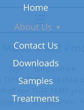
So, to work around that, I think the only way is to create a new menu that is a copy on the main menu but with the top-level menu items repeated as the first sub-menu item. This is what I was trying to illustrate above:
Main menu:
About
-Contact
-FAQs
Hamburger menu for the panel:
About
-About << This is a duplicate of the top-level menu item that will give access to the article/category blog attached to this item
-Contact
-FAQs
I then need to ensure that it is this new Hamburger menu that appears in the panel and not the main menu.
I think I need to create a joomla position in the panel so that I can access it in joomla and assign my Hamburger menu to it.
I think this will work but can you say whether it will work, whether it's the best workaround and tell me how to go about this?
Let me know if you still need access to the (demo) site but if you can point me in the right direction here, hopefully that won't be necessary.
Thanks, Allen.
I may have made some progress but I'm certain I don't fully understand all of this.
I suspect I need to add a position in Desktop to the hamburger panel and call it, say, Hamburger. In joomla, I can then create a menu (that I've called Hamburger) and create a module that places the Hamburger menu in the Hamburger position created in Desktop.
I'm not sure I have this right, so let me go back to basics and explain what I am trying to achieve.
As highlighted in the post that started this topic, top-level hamburger menu items do not display the article/category blog attached to that menu item but simply opens the sub-menu. You say you have no plans to change this. I have an existing site (designed in Artisteer) that has joomla articles and/or joomla Categories attached to each top-level menu item. In my new Nicepage template, this works perfectly in non-mobile screen sizes with the main (text) menu. However, when the Hamburger icon is clicked on in smaller screen sizes, clicking on the top-level menu simply opens the sub-menu levels and does not open the joomla article, There is no way to give the visitor access to that joomla article.
So, to work around that, I think the only way is to create a new menu that is a copy on the main menu but with the top-level menu items repeated as the first sub-menu item. This is what I was trying to illustrate above:
Main menu:
About
-Contact
-FAQs
Hamburger menu for the panel:
About
-About *<< This is a duplicate of the top-level menu item that will give access to the article/category blog attached to this item*
-Contact
-FAQs
I then need to ensure that it is this new Hamburger menu that appears in the panel and not the main menu.
I think I need to create a joomla position in the panel so that I can access it in joomla and assign my Hamburger menu to it.
I think this will work but can you say whether it will work, whether it's the best workaround and tell me how to go about this?
Let me know if you still need access to the (demo) site but if you can point me in the right direction here, hopefully that won't be necessary.
Last edited 20 January 2022 by Alan Henness


