Doug G.
posted this
26 November 2019
Doug,
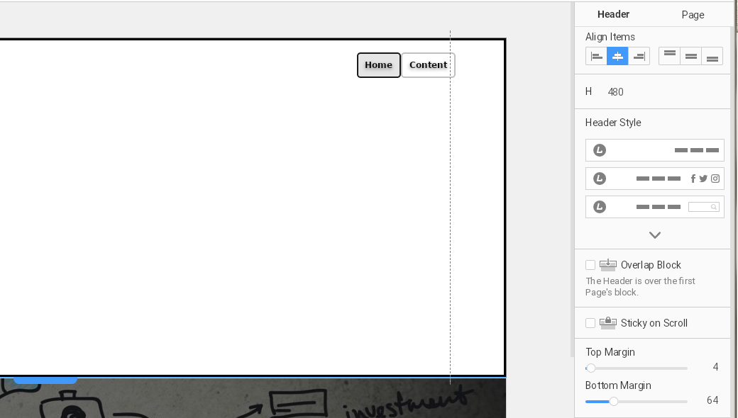
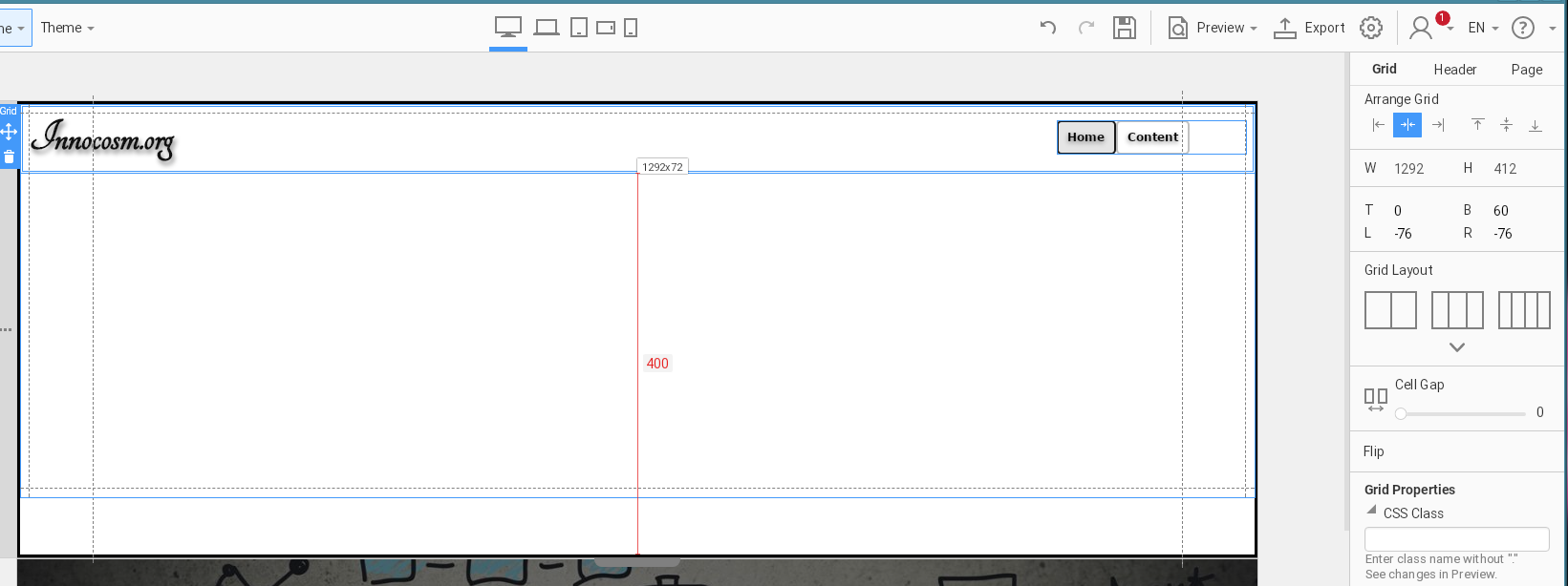
We recommend using the alignment, groups, and grids to get better results in responsive views. In your screenshot, we see that the menu and logo are in the grid, however. The used grid seems to be of only one cell, when it should be two, one for the logo, and another for the menu.
Could you please send us your project and we will try to fix your header following our recommendations as an example. If you like the approach, you will be able to use it in your future works.
When I change the menu it then will cause the block to move to the higher margin you see. If I shrink the block, then resize the grid again, when it snaps back, the margin is also changed back with the 64px margin on the bottom again.
Changing the current one cell grid to two grids as you suggest results in the logo stacked above the menu instead vs the single block that will allow both the logon and menu buttons to shrink so both of the elements remain the horizontal appearance.
I've tried to create two 3 section grids then modify it to one grid so the bottom grid contained the format of the top one in mobile view while marking the top grid to only appear in the desktop and the laptop views and bottom on tablet down to mobile sections before but since it not allow me copy the menu and use it below, I have to create a new menu element. Preview moving shows it works as designed by import into the CMS then creates two content menus due to the way the original menu object can't exist in two places at once, and neither imports into the central mainmenu object utilized to build the menu structure. Importing any updated theme installs existing content is another menu of containing matches of the original articles, the imported content articles have a different ID in the database instead of updating the existing database entry. Because the new articles are added using INSERT instead of UPDATE that causes all the new import content is assigned different ID numbers in the database
This means I have to move the items created to the mainmenu element in order to be displayed as menu options or in a submenu structure in the main menu on each import to be used. Then I have to point the main menu options to any new article imported imported that disables the features in the front page and caused 403 errors which shouldn't appear because the original articles still exist for use on the main menu.

