AI-Powered Page Builder Feedback

xvemanuelvx
373 Posts
xvemanuelvx posted this 3 weeks ago
Wishlist

Hi, I've been trying out the AI Page Builder (NP Version 6.12) and would like to share with you any bugs, ideas and feedback I've found.

  • When choosing the pages more variations, it seems to me that there are always the same templates where only the content is swapped. You could at least always use different fonts, colours etc. so that the results don't always look the same.

  • When full-width images are applied to the background, they are often blurred. A better quality should be used here.

  • Alt texts should also be generated for images.

  • Seo titles, meta descriptions etc. should also be generated.

  • When I enter a location in the description, it should already be preselected in the map.

  • There are some texts that are generated next to icons, but unfortunately the icons do not match the texts. (For example, the text next to the icon is about fresh ingredients, but the icon shows people).

  • Header and footer should also be generated

Hi, I've been trying out the AI Page Builder (NP Version 6.12) and would like to share with you any bugs, ideas and feedback I've found. - When choosing the pages more variations, it seems to me that there are always the same templates where only the content is swapped. You could at least always use different fonts, colours etc. so that the results don't always look the same. - When full-width images are applied to the background, they are often blurred. A better quality should be used here. - Alt texts should also be generated for images. - Seo titles, meta descriptions etc. should also be generated. - When I enter a location in the description, it should already be preselected in the map. - There are some texts that are generated next to icons, but unfortunately the icons do not match the texts. (For example, the text next to the icon is about fresh ingredients, but the icon shows people). - Header and footer should also be generated

Last edited 3 weeks ago by Support Team

Vote to pay developers attention to this features or issue.
7 Replies
Order By: Standard | Newest
Support Team posted this 3 weeks ago

Hello Emanuel,

Thanks for contacting us!

Thanks for helping us improve Nicepage!
Your advice and feedback are beneficial to our development.

If you have any more questions or need any further assistance, feel free to ask!

...................................................
Sincerely,
George.
Nicepage Support Team

Please subscribe to our YouTube channel: http://youtube.com/nicepage?sub_confirmation=1
Follow us on Facebook: http://facebook.com/nicepageapp

Hello Emanuel, Thanks for contacting us! Thanks for helping us improve Nicepage! Your advice and feedback are beneficial to our development. If you have any more questions or need any further assistance, feel free to ask! ................................................... Sincerely, George. Nicepage Support Team Please subscribe to our YouTube channel: http://youtube.com/nicepage?sub_confirmation=1 Follow us on Facebook: http://facebook.com/nicepageapp
Support Team
Support Team posted this 3 weeks ago

Emanuel,

When full-width images are applied to the background, they are often blurred. A better quality should be used here.

Can you please provide a screenshot of this issue?

...................................................
Sincerely,
Nicepage Support Team

Please subscribe to our YouTube channel: http://youtube.com/nicepage?sub_confirmation=1
Follow us on Facebook: http://facebook.com/nicepageapp
Emanuel, > When full-width images are applied to the background, they are often blurred. A better quality should be used here. Can you please provide a screenshot of this issue? ................................................... Sincerely, Nicepage Support Team Please subscribe to our YouTube channel: http://youtube.com/nicepage?sub_confirmation=1 Follow us on Facebook: http://facebook.com/nicepageapp
isoftant
27 Posts
isoftant posted this 3 weeks ago

Hello!

Thanks for the innovations in nicepage!

It would be very good to use Artificial Intelligence for
converting website pages to lower resolutions.
A lot of time is spent setting up website pages for different resolutions.
And mainly for mobile phones.

Anatoli.

Hello! Thanks for the innovations in nicepage! It would be very good to use Artificial Intelligence for converting website pages to lower resolutions. A lot of time is spent setting up website pages for different resolutions. And mainly for mobile phones. Anatoli.
Support Team
Support Team posted this 3 weeks ago

Hello,

Nicepage provides various algorithms to adapt the created layout for smaller screens. But it is impossible to automate everything. Therefore, you need to follow certain rules that will facilitate page building:

-use the layout controls like Group, Grid, List. This is important when you need to move a few controls together. Also, it is better to use control alignment options available on the right-side panel;
-use the "Reset Responsive" option. Each responsive mode can have its own settings for individual controls. This option removes all adjustments, and you can start all over again. Sometimes this is the best solution. Then you adjust the responsive layout from Desktop to Phone mode.
-keep in mind that not all control settings can be changed in each responsive mode separately. Only some style changes can be changed. And only if these changes do not affect the page HTML structure. For example, you can change the position of the element and move it a few pixels left or right, change font size, etc. But you cannot change the order of elements or move the control outside the Grid/Group.
-keep in mind that there is an inheritance of the responsive settings. It goes from Desktop to Phone mode and stops when you make changes in any responsive mode. You can back to this inheritance with the "Reset Responsive" option.
https://nicepage.com/doc/5249/responsive-web-design
https://nicepage.com/doc/1125/responsive-modes
https://nicepage.com/doc/36215/build-responsive-websites
...................................................
Sincerely,
Anna.
Nicepage Support Team

Please subscribe to our YouTube channel: http://youtube.com/nicepage?sub_confirmation=1
Follow us on Facebook: http://facebook.com/nicepageapp

Hello, Nicepage provides various algorithms to adapt the created layout for smaller screens. But it is impossible to automate everything. Therefore, you need to follow certain rules that will facilitate page building: -use the layout controls like Group, Grid, List. This is important when you need to move a few controls together. Also, it is better to use control alignment options available on the right-side panel; -use the "Reset Responsive" option. Each responsive mode can have its own settings for individual controls. This option removes all adjustments, and you can start all over again. Sometimes this is the best solution. Then you adjust the responsive layout from Desktop to Phone mode. -keep in mind that not all control settings can be changed in each responsive mode separately. Only some style changes can be changed. And only if these changes do not affect the page HTML structure. For example, you can change the position of the element and move it a few pixels left or right, change font size, etc. But you cannot change the order of elements or move the control outside the Grid/Group. -keep in mind that there is an inheritance of the responsive settings. It goes from Desktop to Phone mode and stops when you make changes in any responsive mode. You can back to this inheritance with the "Reset Responsive" option. https://nicepage.com/doc/5249/responsive-web-design https://nicepage.com/doc/1125/responsive-modes https://nicepage.com/doc/36215/build-responsive-websites ................................................... Sincerely, Anna. Nicepage Support Team Please subscribe to our YouTube channel: http://youtube.com/nicepage?sub_confirmation=1 Follow us on Facebook: http://facebook.com/nicepageapp
xvemanuelvx
373 Posts
xvemanuelvx posted this 3 weeks ago

Emanuel,

When full-width images are applied to the background, they are often blurred. A better quality should be used here.

Can you please provide a screenshot of this issue?

...................................................
Sincerely,
Nicepage Support Team

Please subscribe to our YouTube channel: http://youtube.com/nicepage?sub_confirmation=1
Follow us on Facebook: http://facebook.com/nicepageapp

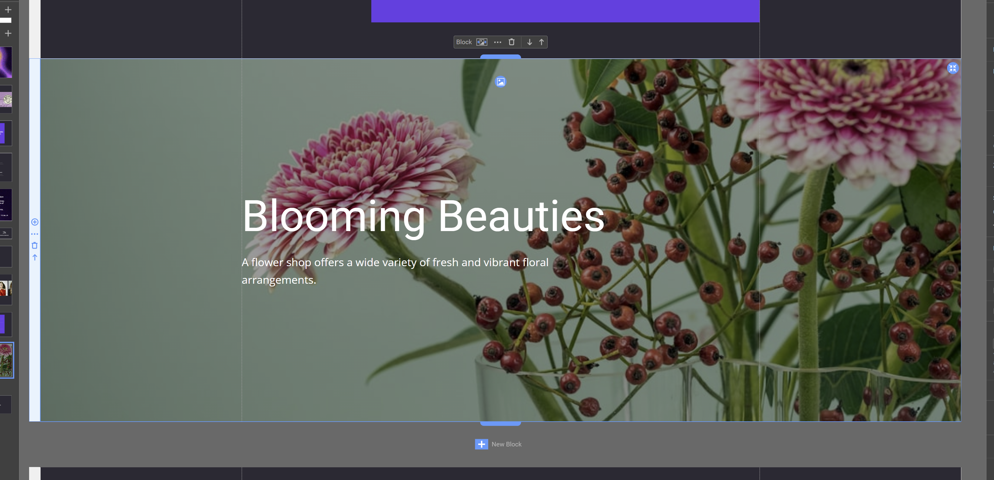
For example, I used the AI Block Builder to generate a blog with the photo selected from Unsplash in the background. Unfortunately, the image is a little blurred. View on large screens

Screenshot-2024-06-17-180818.png

> Emanuel, > > > When full-width images are applied to the background, they are often blurred. A better quality should be used here. > > Can you please provide a screenshot of this issue? > > ................................................... > Sincerely, > Nicepage Support Team > > Please subscribe to our YouTube channel: http://youtube.com/nicepage?sub_confirmation=1 > Follow us on Facebook: http://facebook.com/nicepageapp For example, I used the AI Block Builder to generate a blog with the photo selected from Unsplash in the background. Unfortunately, the image is a little blurred. View on large screens !Screenshot-2024-06-17-180818.png!
Support Team
Support Team posted this 3 weeks ago

Emanuel,

Unsplash images that can be found directly in your Images are all provided in FM format with the smallest available size. You can always check for a higher image size by following the https://unsplash.com/ site.

...................................................
Sincerely,
Anna.
Nicepage Support Team

Please subscribe to our YouTube channel: http://youtube.com/nicepage?sub_confirmation=1
Follow us on Facebook: http://facebook.com/nicepageapp

Emanuel, Unsplash images that can be found directly in your Images are all provided in FM format with the smallest available size. You can always check for a higher image size by following the https://unsplash.com/ site. ................................................... Sincerely, Anna. Nicepage Support Team Please subscribe to our YouTube channel: http://youtube.com/nicepage?sub_confirmation=1 Follow us on Facebook: http://facebook.com/nicepageapp
isoftant
27 Posts
isoftant posted this 2 weeks ago

Hello,

Nicepage provides various algorithms to adapt the created layout for smaller screens. But it is impossible to automate everything. Therefore, you need to follow certain rules that will facilitate page building:

-use the layout controls like Group, Grid, List. This is important when you need to move a few controls together. Also, it is better to use control alignment options available on the right-side panel;
-use the "Reset Responsive" option. Each responsive mode can have its own settings for individual controls. This option removes all adjustments, and you can start all over again. Sometimes this is the best solution. Then you adjust the responsive layout from Desktop to Phone mode.
-keep in mind that not all control settings can be changed in each responsive mode separately. Only some style changes can be changed. And only if these changes do not affect the page HTML structure. For example, you can change the position of the element and move it a few pixels left or right, change font size, etc. But you cannot change the order of elements or move the control outside the Grid/Group.
-keep in mind that there is an inheritance of the responsive settings. It goes from Desktop to Phone mode and stops when you make changes in any responsive mode. You can back to this inheritance with the "Reset Responsive" option.
https://nicepage.com/doc/5249/responsive-web-design
https://nicepage.com/doc/1125/responsive-modes
https://nicepage.com/doc/36215/build-responsive-websites
...................................................
Sincerely,
Anna.
Nicepage Support Team

Please subscribe to our YouTube channel: http://youtube.com/nicepage?sub_confirmation=1
Follow us on Facebook: http://facebook.com/nicepageapp

Thank you very much Anna! Very valuable information!

Anatoli.

> Hello, > > Nicepage provides various algorithms to adapt the created layout for smaller screens. But it is impossible to automate everything. Therefore, you need to follow certain rules that will facilitate page building: > > -use the layout controls like Group, Grid, List. This is important when you need to move a few controls together. Also, it is better to use control alignment options available on the right-side panel; > -use the "Reset Responsive" option. Each responsive mode can have its own settings for individual controls. This option removes all adjustments, and you can start all over again. Sometimes this is the best solution. Then you adjust the responsive layout from Desktop to Phone mode. > -keep in mind that not all control settings can be changed in each responsive mode separately. Only some style changes can be changed. And only if these changes do not affect the page HTML structure. For example, you can change the position of the element and move it a few pixels left or right, change font size, etc. But you cannot change the order of elements or move the control outside the Grid/Group. > -keep in mind that there is an inheritance of the responsive settings. It goes from Desktop to Phone mode and stops when you make changes in any responsive mode. You can back to this inheritance with the "Reset Responsive" option. > https://nicepage.com/doc/5249/responsive-web-design > https://nicepage.com/doc/1125/responsive-modes > https://nicepage.com/doc/36215/build-responsive-websites > ................................................... > Sincerely, > Anna. > Nicepage Support Team > > Please subscribe to our YouTube channel: http://youtube.com/nicepage?sub_confirmation=1 > Follow us on Facebook: http://facebook.com/nicepageapp Thank you very much Anna! Very valuable information! Anatoli.
You must log in or register to leave comments