
kontakt27
posted this
31 October 2019

Hi,
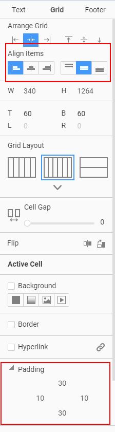
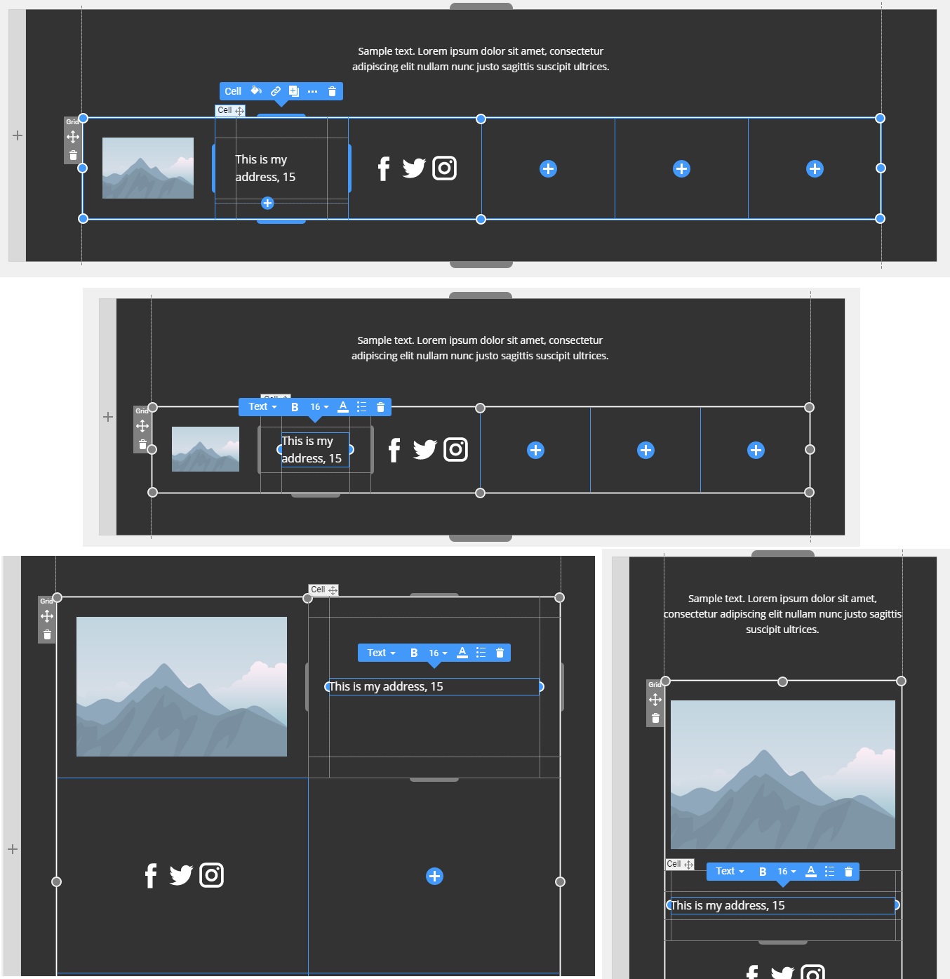
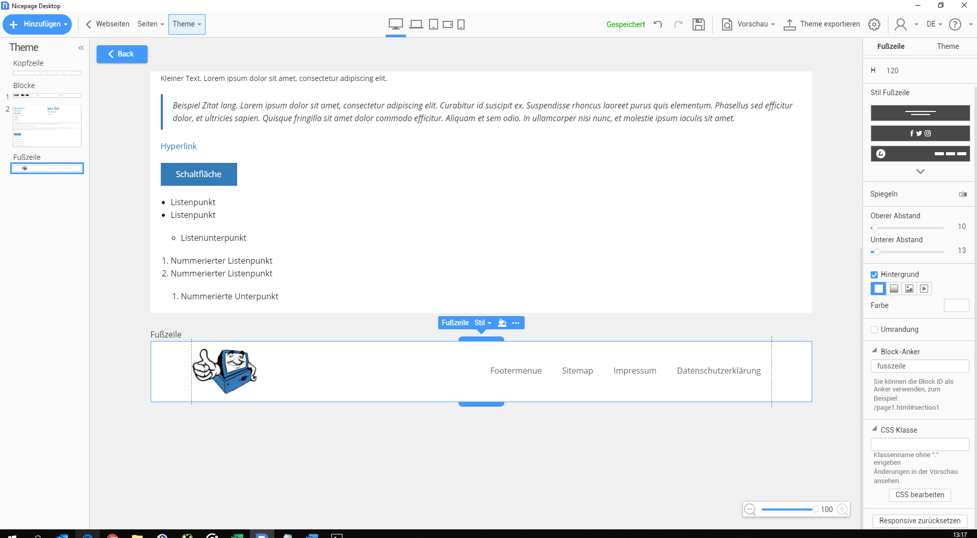
could you please offer more prefarbricated header and footer templates. All all previously offered don´t contain enough fields. Working with grids within - for example - the footer makes terrrible and crazy things in different desktop, mobil and smartphone modes. Working with a menu, logo, adress, social media icons an copyright in the footer is nearly impossible and takes hours to design it correctly.
Same problem concering the header. Typical fields are logo, menu, adress, search-field an so on.
A solution would be very, very helpful. Working like now cost too much time.
Vote to pay developers attention to this features or issue.

