
Jeff Hartley
posted this
25 October 2019

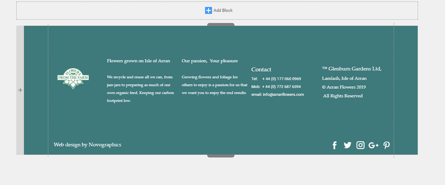
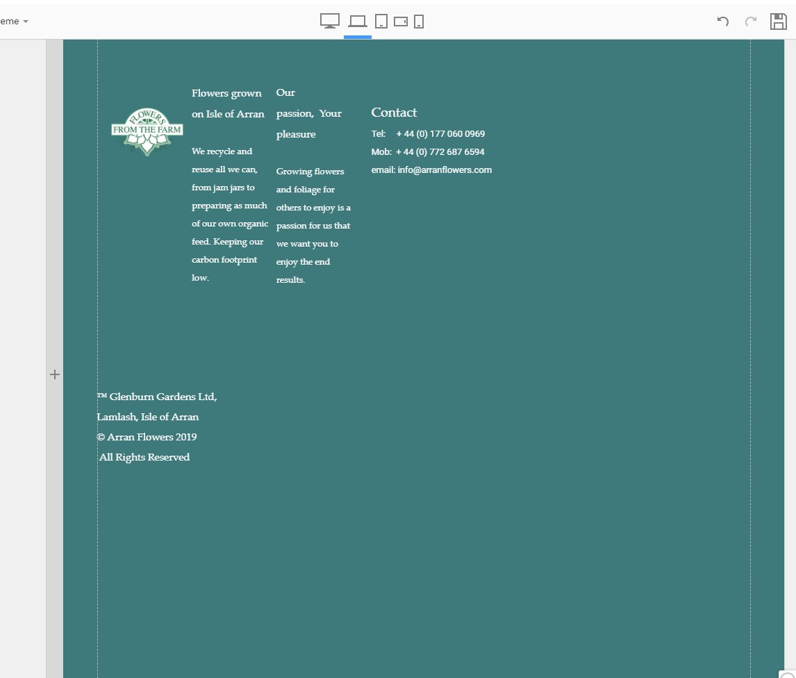
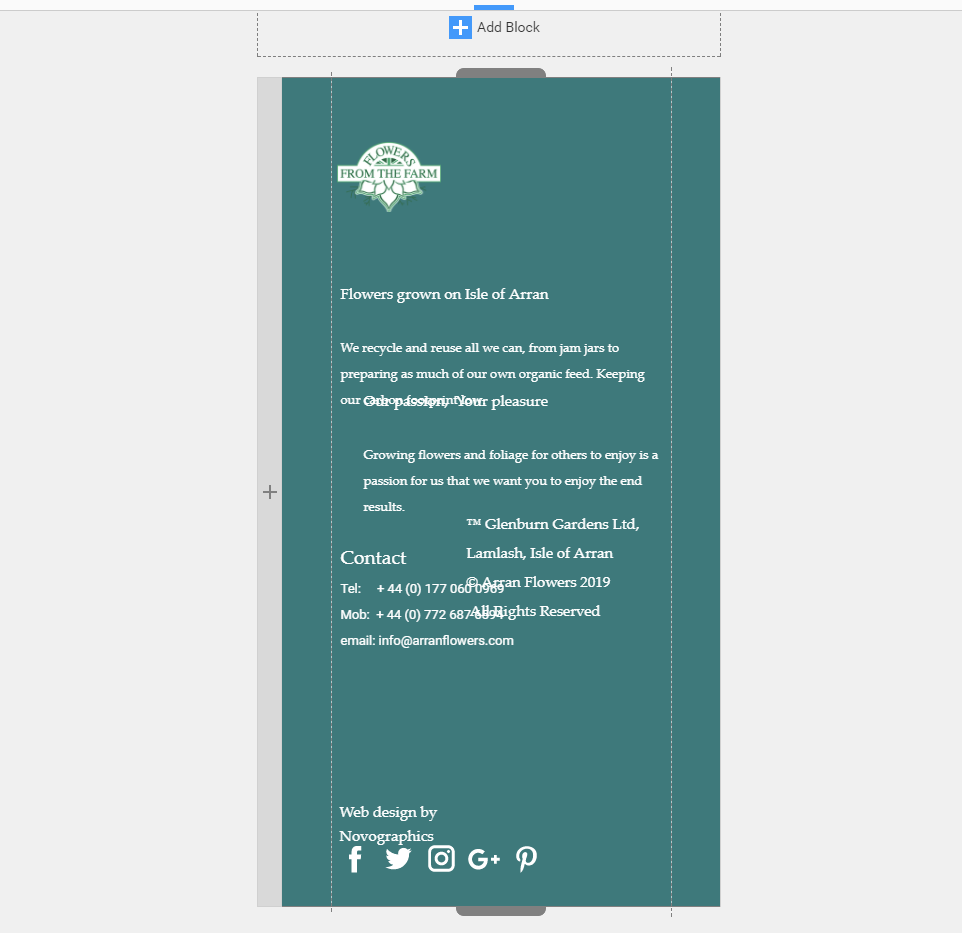
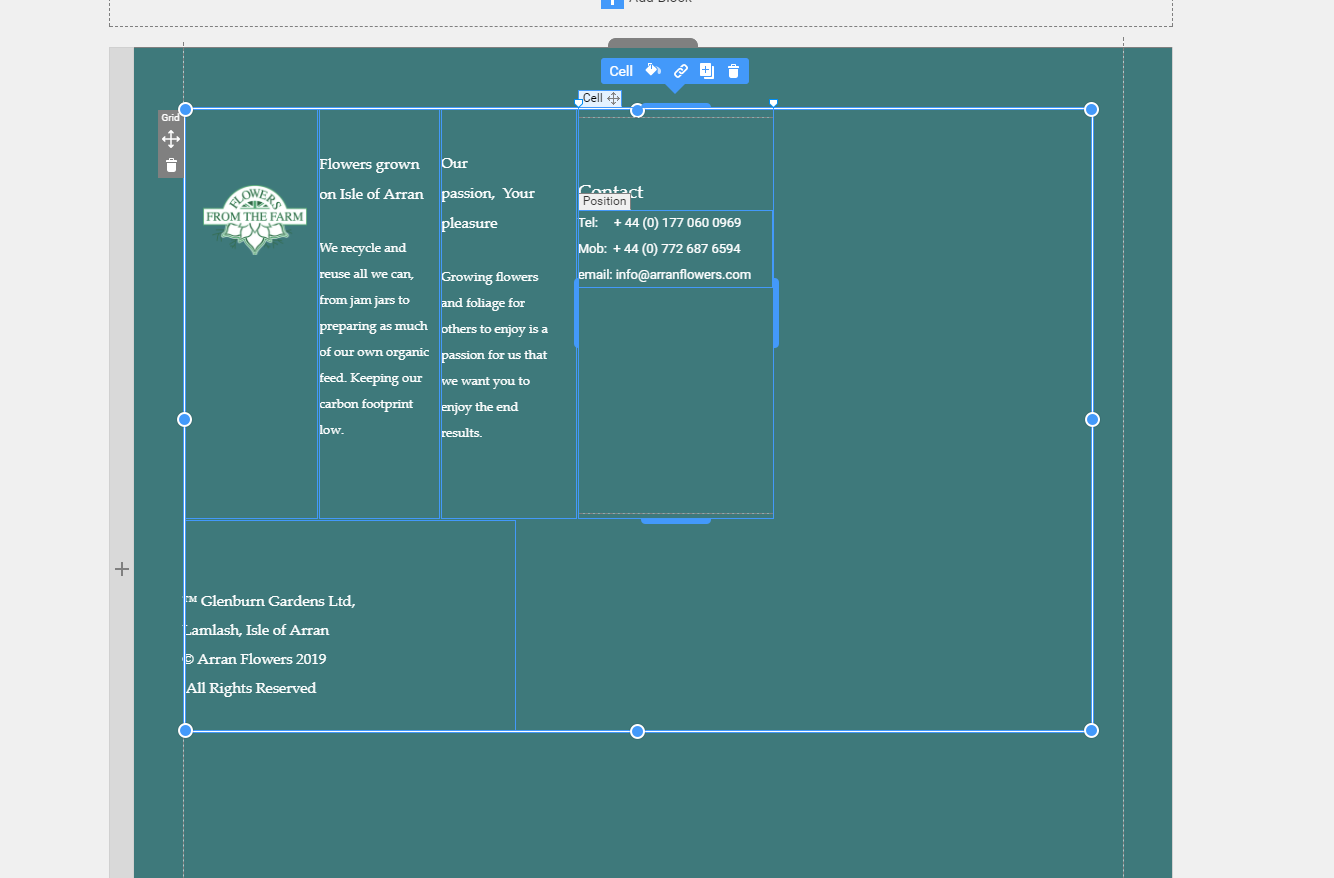
OK gimme a clue..... footer ... responsive??
give me a clue how to solve this one?? This is changed since yesterday as it wasnt doing this then....
Vote to pay developers attention to this features or issue.

