denis229
posted this
21 July 2022

Hi,
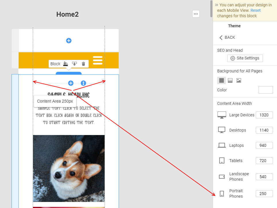
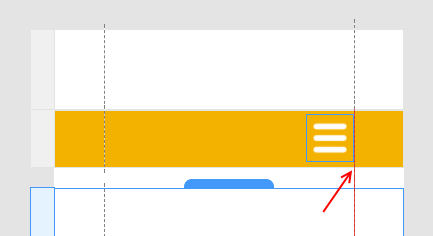
we are in trouble with the position of menu when is resized, it doesen't stay in the correct position (evenmore when it goes to hamburger menu), this fact creates another problem becouse in some way it enable a sort of horizontal scrolling of the page that compromises the UX.
Please let me know how to fix it.
Best regards
Vote to pay developers attention to this features or issue.