
dominique.prevots
posted this
05 December 2021

Hello,
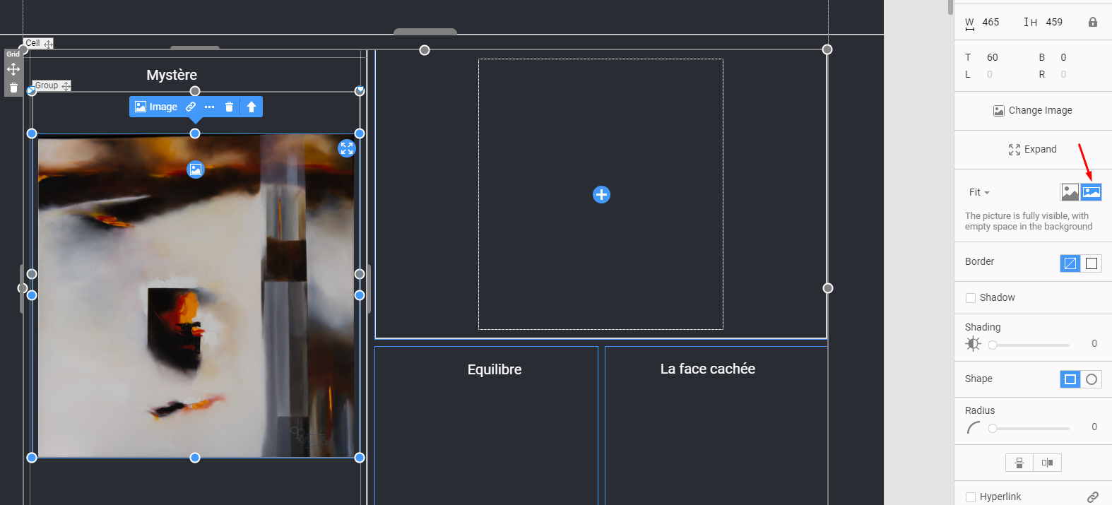
I have many difficulties to manage images between different devices to get a responsive site.
For example, in the page joined
It's ok with desktop, laptop, but not tablets, landscape phone and portrait phone...
It doesn't wrong on all the images but only some images. I manage all my image with the same way, for each image I create a recipient with inside the image and the title with a text block, to get the same position between the image and the text.
I join some views to show defaults. The first two are ok, the third is bad.
The link to upload the export of the page: http://servimg.artdomi.com/Interrogations
Thank you
Last edited 05 December 2021 by dominique.prevots
Vote to pay developers attention to this features or issue.