
hatsumelo_tw5
posted this
02 May 2021

Hello.
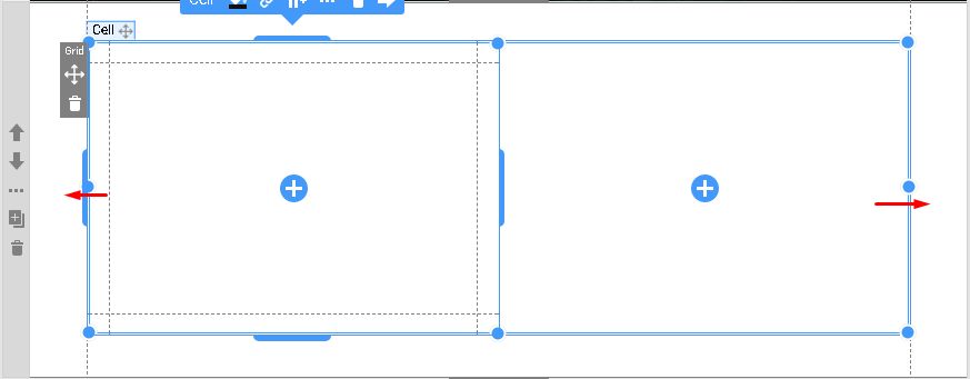
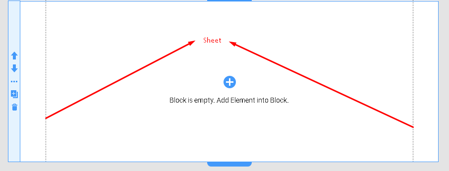
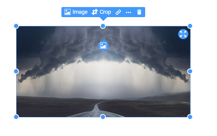
I understand that to maintain the aspect ratio of the fixed page image, adjust the height until you see a red diagonal line. But it doesn't work when the image is "Cover". That said, if you set the image to "Contain", extra margins will be created when you lower the zoom in the browser settings.
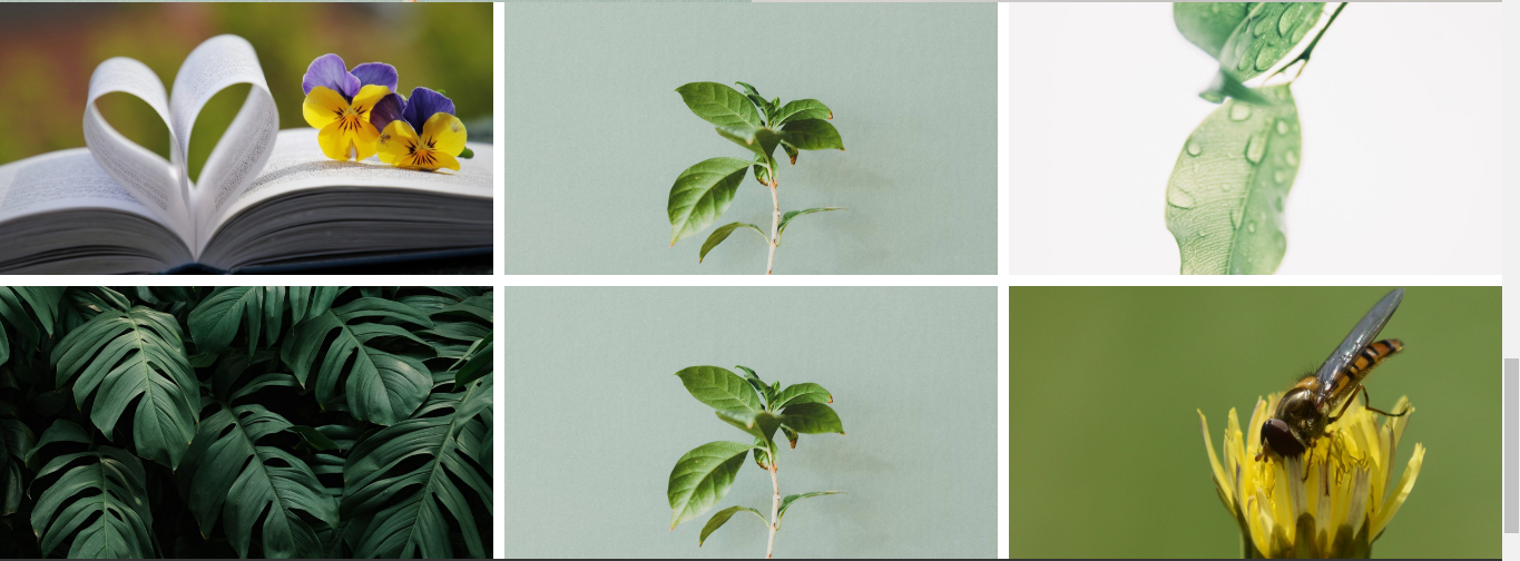
The same is true when using the gallery element, and even if you adjust the height until a red diagonal line appears, the aspect ratio is still not maintained when the image is set to "Cover".
I'm in great trouble because I can't reach the itch.
Vote to pay developers attention to this features or issue.