SITE IS NOT MOBILE RESPONSIVE AND CHANGES MADE ON THE WORDPRESS PLUGIN EDITOR ARE NOT UPDATING ON WEBSITE.

nelliewaeni27
2 Posts
nelliewaeni27 posted this 10 April 2021
Ask a Question

Why is my site not mobile responsive. All my text are within the boundaries. Everything looks good on the dashboard but when I check it on all the devices, it is not responsive. And then when I make changes to remove the logo, the nicepage template is not updating. When I change the layout, it is also not responding. Nothing I do makes it respond. Also, the menu keeps appearing and disappearing. Is this nicepage template site really worth it? I'm frustrated and annoyed with all the little fixes I have to do that don't stick
Why is my site not mobile responsive. All my text are within the boundaries. Everything looks good on the dashboard but when I check it on all the devices, it is not responsive. And then when I make changes to remove the logo, the nicepage template is not updating. When I change the layout, it is also not responding. Nothing I do makes it respond. Also, the menu keeps appearing and disappearing. Is this nicepage template site really worth it? I'm frustrated and annoyed with all the little fixes I have to do that don't stick
Vote to pay developers attention to this features or issue.
1 Reply
Order By: Standard | Newest
Support Team
Support Team posted this 12 April 2021

Hi,

Thanks for contacting us

The best way to adjust your website's responsiveness is to do it one-by-one, from left to right, from Desktop to mobile Portrait mode.
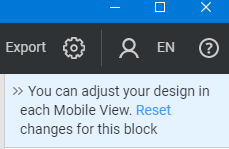
If necessary, kindly press "Reset" on the property panel.

reset.png

Also, we have noticed that you are using WordPress, please note, in the Free Starter Plan you can't edit and design the WordPress pages.
You can design your website in the Desktop App and then export it to your website.

If you have other questions, please feel free to contacts us.
Our team will be pleased to assist you.

Best Regards,
...................................................
Sincerely,
Ahmad M.
Nicepage Support Team

Please subscribe to our YouTube channel: http://youtube.com/nicepage?sub_confirmation=1.
Follow us on Facebook: http://facebook.com/nicepageapp.

Hi, Thanks for contacting us The best way to adjust your website's responsiveness is to do it one-by-one, from left to right, from Desktop to mobile Portrait mode. If necessary, kindly press "Reset" on the property panel. !reset.png! Also, we have noticed that you are using WordPress, please note, in the *Free Starter Plan* you can't edit and design the WordPress pages. You can design your website in the Desktop App and then export it to your website. If you have other questions, please feel free to contacts us. Our team will be pleased to assist you. Best Regards, ................................................... Sincerely, Ahmad M. Nicepage Support Team Please subscribe to our YouTube channel: http://youtube.com/nicepage?sub_confirmation=1. Follow us on Facebook: http://facebook.com/nicepageapp.
You must log in or register to leave comments