


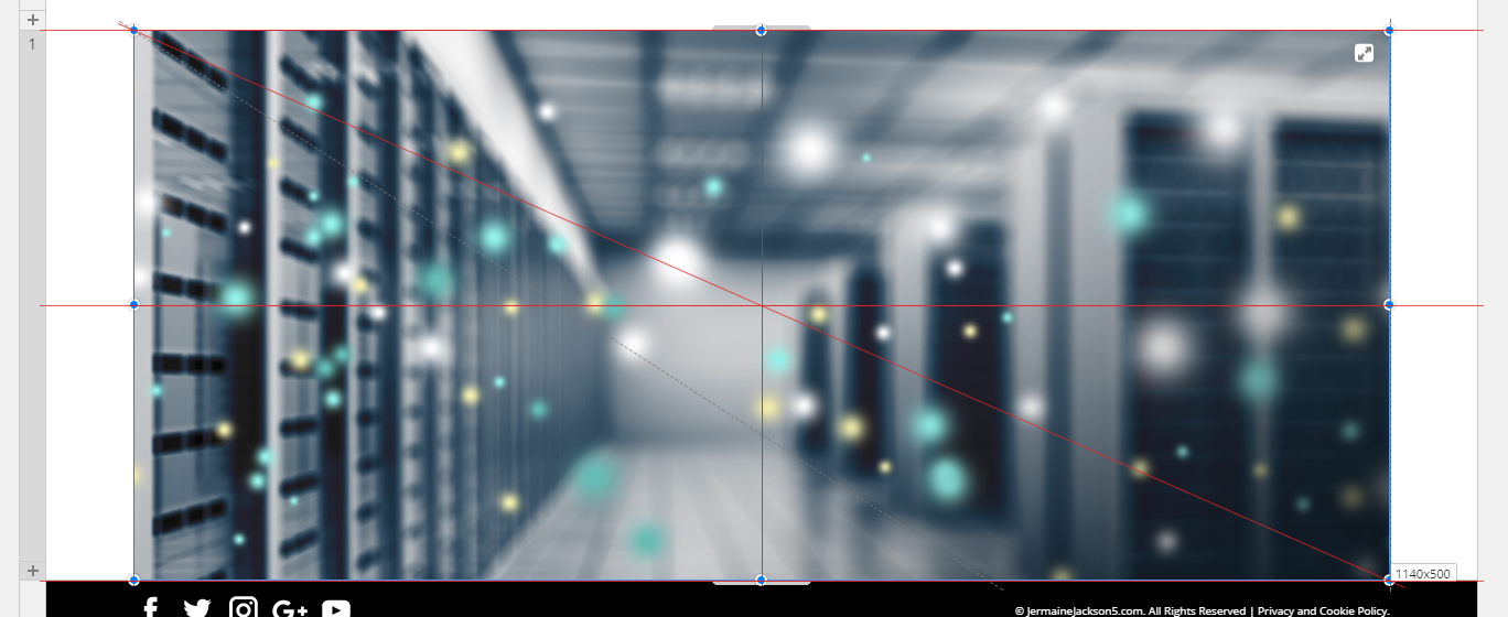
After a few days watching the videos I started with my first real design. You can see it here:
http://niceplay.codeigniter.org.uk
It is nowhere near finished, of course.
Note that when you reduce the viewport, the size of the elements on the page reduces, and the menu changes to a hamburger, as expected, but the spacing between the elements increases, which is not expected. This is code produced by Nicepage - I have not tweaked it all. I watched the responsive part of the intro video and everything seemed to be OK, so I'm obviously doing something wrong, but what ??
If you look at the main site: www.codeigniter.org.uk, this is a responsive site using Bootstrap 4 which I made myself and the media queries work as expected. ( Not all the site is completed yet )
So - let me in on the secret of how to do responsive wed designs with Nicepage !
Keith Taylor
After a few days watching the videos I started with my first real design. You can see it here: http://niceplay.codeigniter.org.uk It is nowhere near finished, of course. Note that when you reduce the viewport, the size of the elements on the page reduces, and the menu changes to a hamburger, as expected, but the spacing between the elements increases, which is not expected. This is code produced by Nicepage - I have not tweaked it all. I watched the responsive part of the intro video and everything seemed to be OK, so I'm obviously doing something wrong, but what ?? If you look at the main site: www.codeigniter.org.uk, this is a responsive site using Bootstrap 4 which I made myself and the media queries work as expected. ( Not all the site is completed yet ) So - let me in on the secret of how to do responsive wed designs with Nicepage ! Keith TaylorLast edited 20 November 2018 by Jacob Rees-Mogg