
Kompressionszentrum Schweiz
posted this
28 December 2020

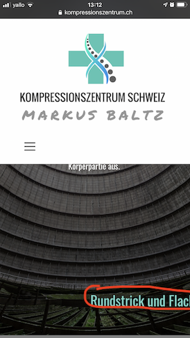
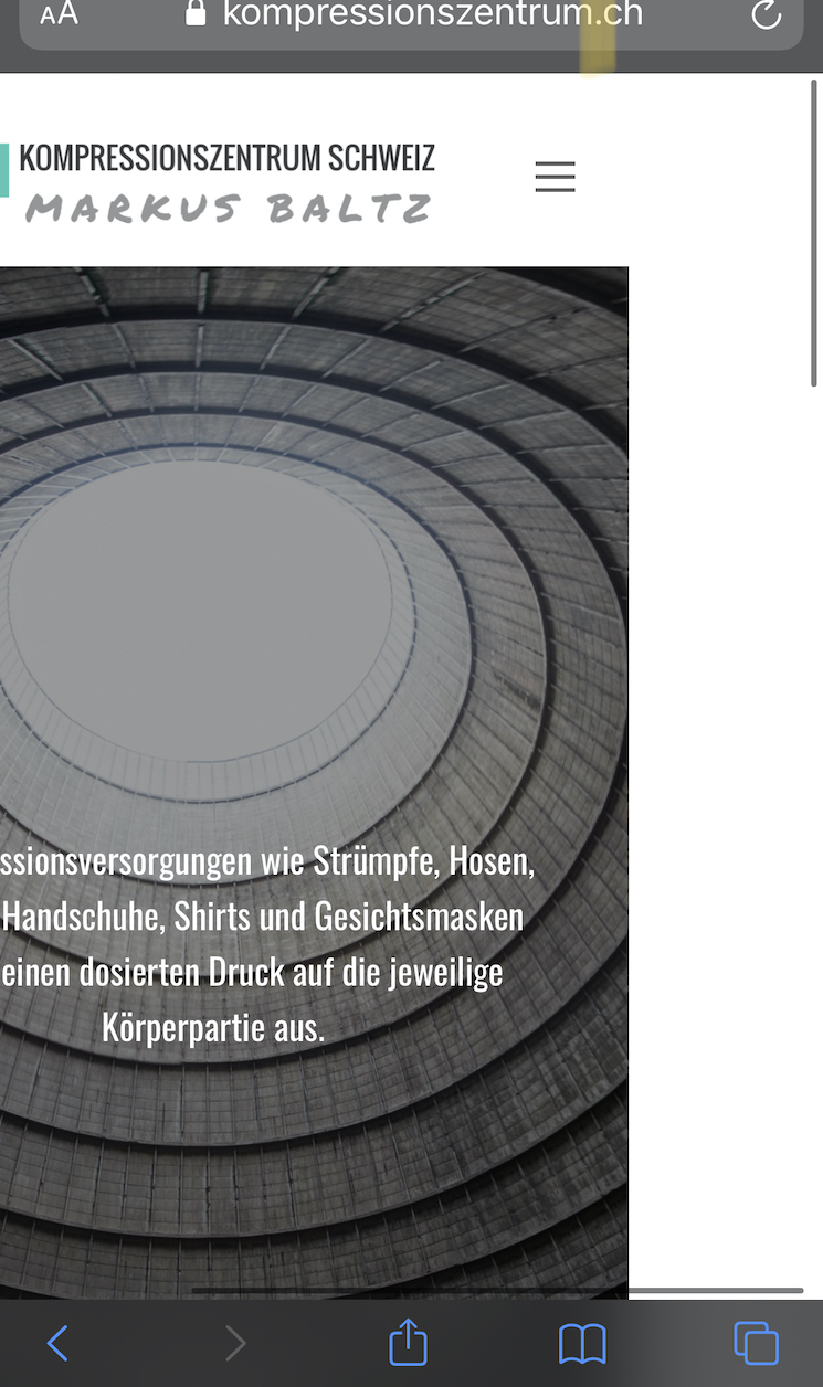
I created a site using Nicepage (with grids) and imported it successfully in Joomla. When previewing the different layouts on the different devices it looks bad already and on the different screen sizes ALL goes wrong when using different devices and browsers! When looking at my website with different browsers on pc, laptop, tablet and mobile devices the biggest problems are:
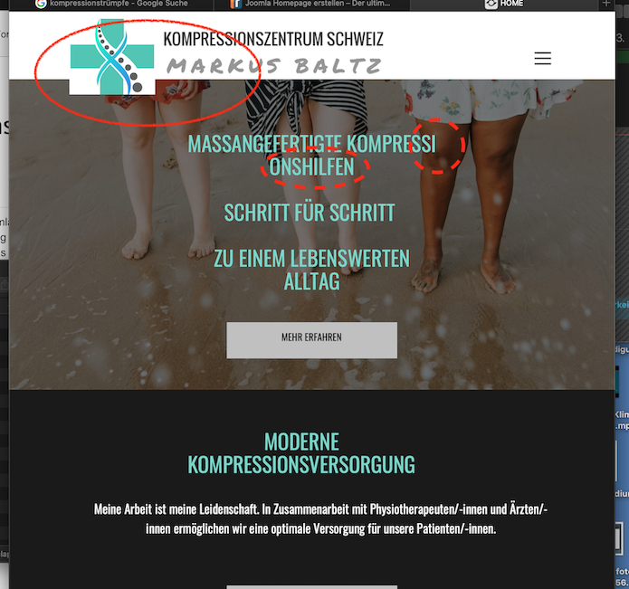
- words are broken into next row at any letter
- sometimes words are not broken but just cut of and unreadable
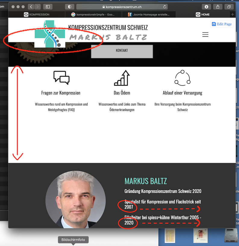
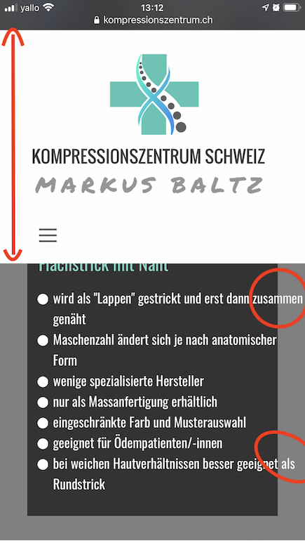
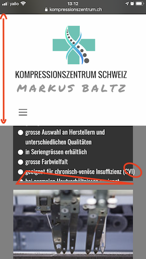
- the header enlarges on mobile phone and literally takes half of the screen!!! on other devices it enlarges the background colour as well
- most blocks expand to crazy sizes when i downsize the website and create a lot of empty space in background colour but at the same time
- some texts are cut and not fully readable
- on laptop the header background shrinks too much but not the pictures and even if there is enough space for the proper menu it decides to put the hamburger ..
look at photos please, there you can see what I tried to describe.
What am I missing? Why is the site not responsive? Thanks for your help, stay safe and better 2021 for all!
Last edited 28 December 2020 by Kompressionszentrum Schweiz
Vote to pay developers attention to this features or issue.
