Support Team
posted this
19 November 2020
Hi,
Could you please describe in detail what difficulties you encountered?
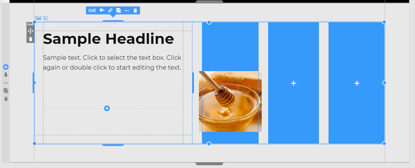
In general, you can use the 4 columns grid too:
The exact solution depends on the result you want to achieve in each responsive mode. But in any case, you will need to make manual adjustments to make the Block look as it should.
...................................................
Sincerely,
Olivia
Nicepage Support Team
Please subscribe to our YouTube channel: http://youtube.com/nicepage?sub_confirmation=1
Follow us on Facebook: http://facebook.com/nicepageapp
Hi,
Could you please describe in detail what difficulties you encountered?
In general, you can use the 4 columns grid too:
!grid-example.png!
The exact solution depends on the result you want to achieve in each responsive mode. But in any case, you will need to make manual adjustments to make the Block look as it should.
...................................................
Sincerely,
Olivia
Nicepage Support Team
Please subscribe to our YouTube channel: http://youtube.com/nicepage?sub_confirmation=1
Follow us on Facebook: http://facebook.com/nicepageapp


