


Hello, NP Team! Hope you have a nice day.
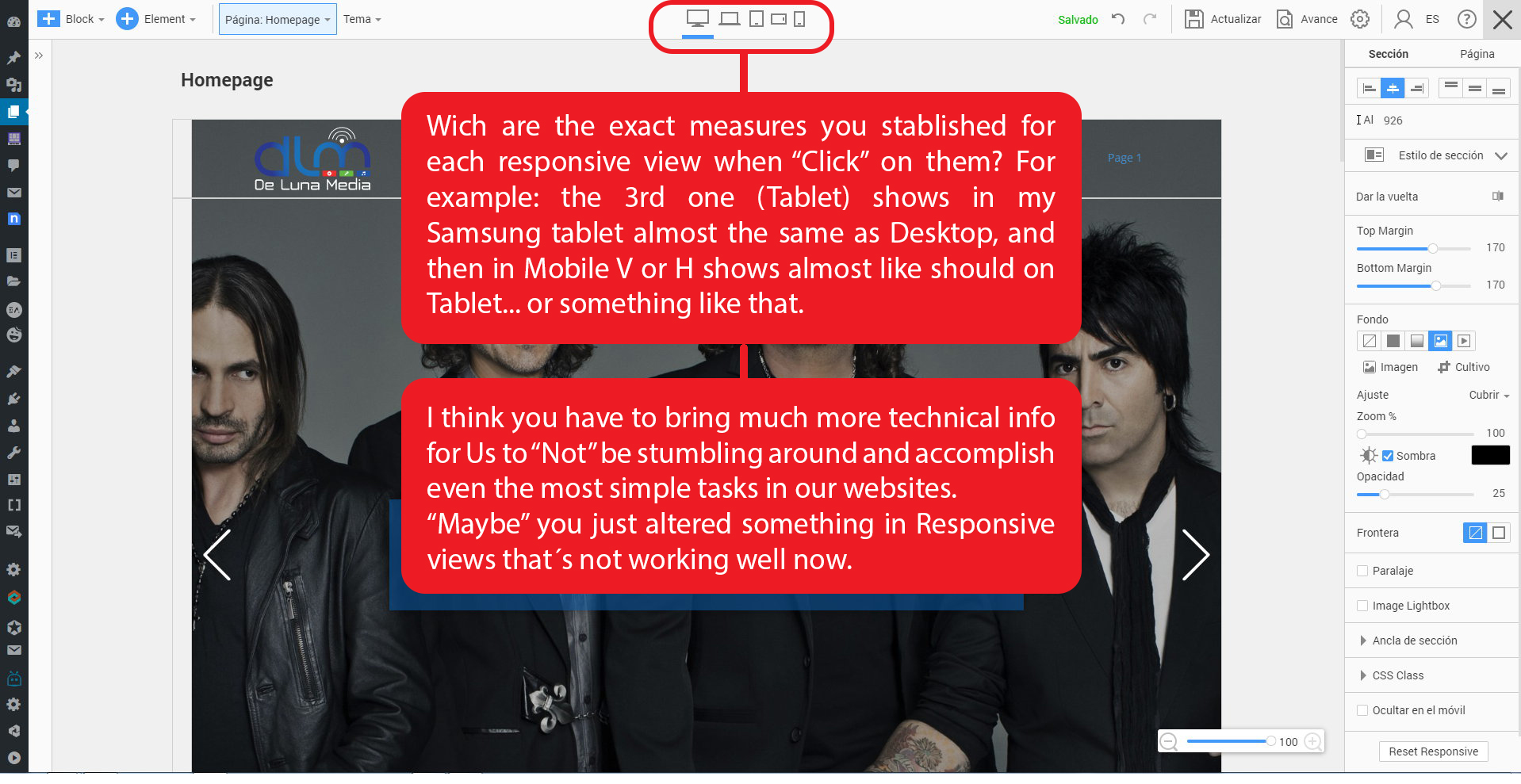
I think you should publish/share the exact measures you considered when stablished the five responsive views for the app, because I´m having problems "matching them" with my real dispositives... Both, Tablet and Mobile phone.
Or maybe you can insert like a "Screen Limit View Marker" so we can understand in every view how every block will show... if it will be shown complete and partial. I ask for this because I would like websites that could be navegate with anchor links and show really owesome on each responsive view... or at least know the exact measures for each screen so I can decide how the content of each block will be looked at for the visitors. That would be really great!
Please, check the image for more details...
Thank you for your time.
Hello, NP Team! Hope you have a nice day. I think you should publish/share the exact measures you considered when stablished the five responsive views for the app, because I´m having problems "matching them" with my real dispositives... Both, Tablet and Mobile phone. Or maybe you can insert like a "Screen Limit View Marker" so we can understand in every view how every block will show... if it will be shown complete and partial. I ask for this because I would like websites that could be navegate with anchor links and show really owesome on each responsive view... or at least know the exact measures for each screen so I can decide how the content of each block will be looked at for the visitors. That would be really great! Please, check the image for more details... Thank you for your time.Last edited 15 February 2020 by LGALLP