Doug G.
posted this
10 December 2019
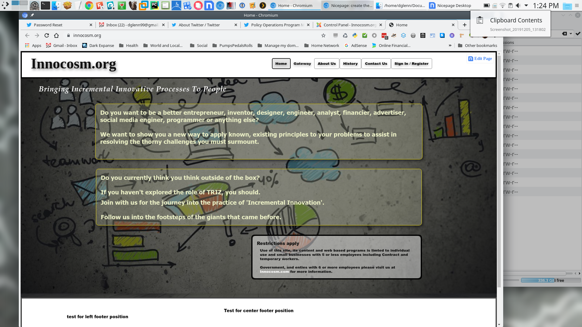
Note: All these screenshots were made with v2.1.0. The pictures prefaces with desktop are prefaced that way. These snapshots were taken after I had simply opened the project from the previous version.
Note 2: The pictures both above and here were taken the first time I ran v2.1.0. Previously with prior version everything displayed properly except the issue with footer grid display.
The footer didn't change after saving the project and exporting then importing on the website shows the mismatch on the center footer had not changed.
Here is how those two preview responsive views appear in the Desktop prior to the previews above. Margon on cell from left to the right on the cells themselves is auto,auto each with a 6 px gap between the cells.
Booth menus appear inside the inner border line on the right while the logo view is normally 20px from the margin I moved it also within the inner border also to properly display. All the shots made with Nicepage 2.20.
This how the footer elements are displayed through google web tools. The Smaller short size like | represents group where the elements of the text appear. Note the center appears bunched up where the text resides. Yet all cells have duplicate measurements.
Note: All these screenshots were made with v2.1.0. The pictures prefaces with desktop are prefaced that way. These snapshots were taken after I had simply opened the project from the previous version.
Note 2: The pictures both above and here were taken the first time I ran v2.1.0. Previously with prior version everything displayed properly except the issue with footer grid display.
The footer didn't change after saving the project and exporting then importing on the website shows the mismatch on the center footer had not changed.
!WebsiteRightFooterElementInfo.png!
Here is how those two preview responsive views appear in the Desktop prior to the previews above. Margon on cell from left to the right on the cells themselves is auto,auto each with a 6 px gap between the cells.
!DesktopPortraitLanscapge.png!
!DesktopPreviewLandscape.png!
Booth menus appear inside the inner border line on the right while the logo view is normally 20px from the margin I moved it also within the inner border also to properly display. All the shots made with Nicepage 2.20.
This how the footer elements are displayed through google web tools. The Smaller short size like | represents group where the elements of the text appear. Note the center appears bunched up where the text resides. Yet all cells have duplicate measurements.


