
tdi-tuning
posted this
27 October 2023

Hi,
I have Nicepage for a few months, since I am not the coder this is a good solution for me.
I hope here for the help of you, for a long time I try a
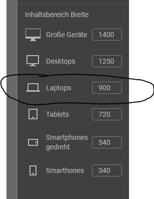
page correctly. That it displays correctly when opened on a latop and also on a 28" monitor.
With me it is always too big on the laptop and you see only half the page. Although I have adjusted it.
The settings for this with the width do not work in my opinion. Am I doing something wrong here or can Nicepage not better?
Does anyone of you have a link from a website that was made with Nicepage? I would like to see the whole thing with the laptop 14" and a normal monitor of 28" inch.
Thanks in advance,
mfg.
Vote to pay developers attention to this features or issue.
