Support Team
posted this
26 October 2023
Hello,
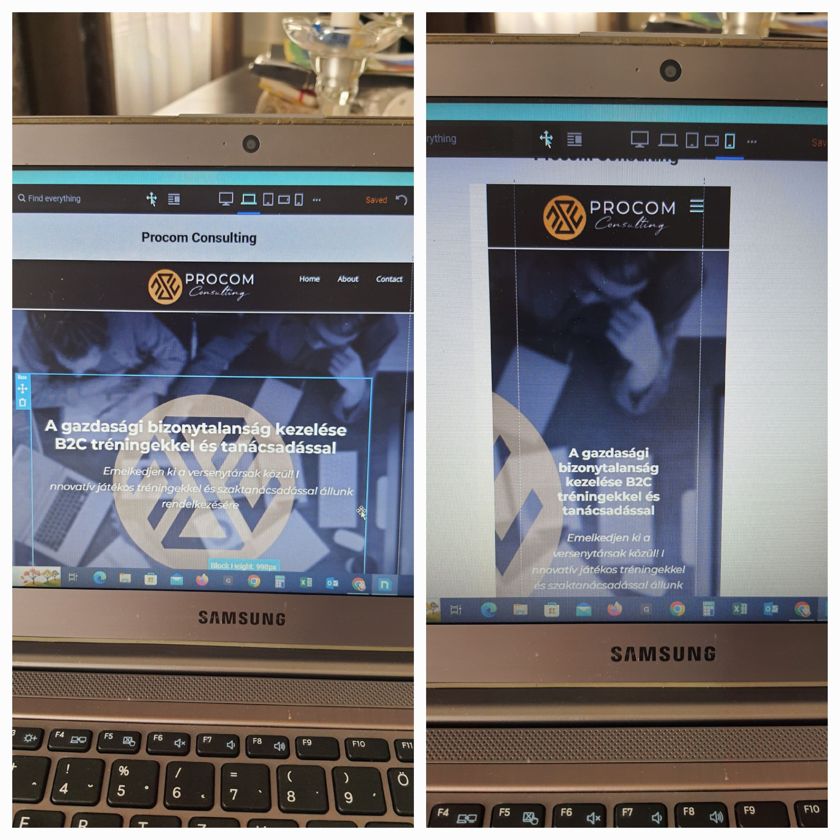
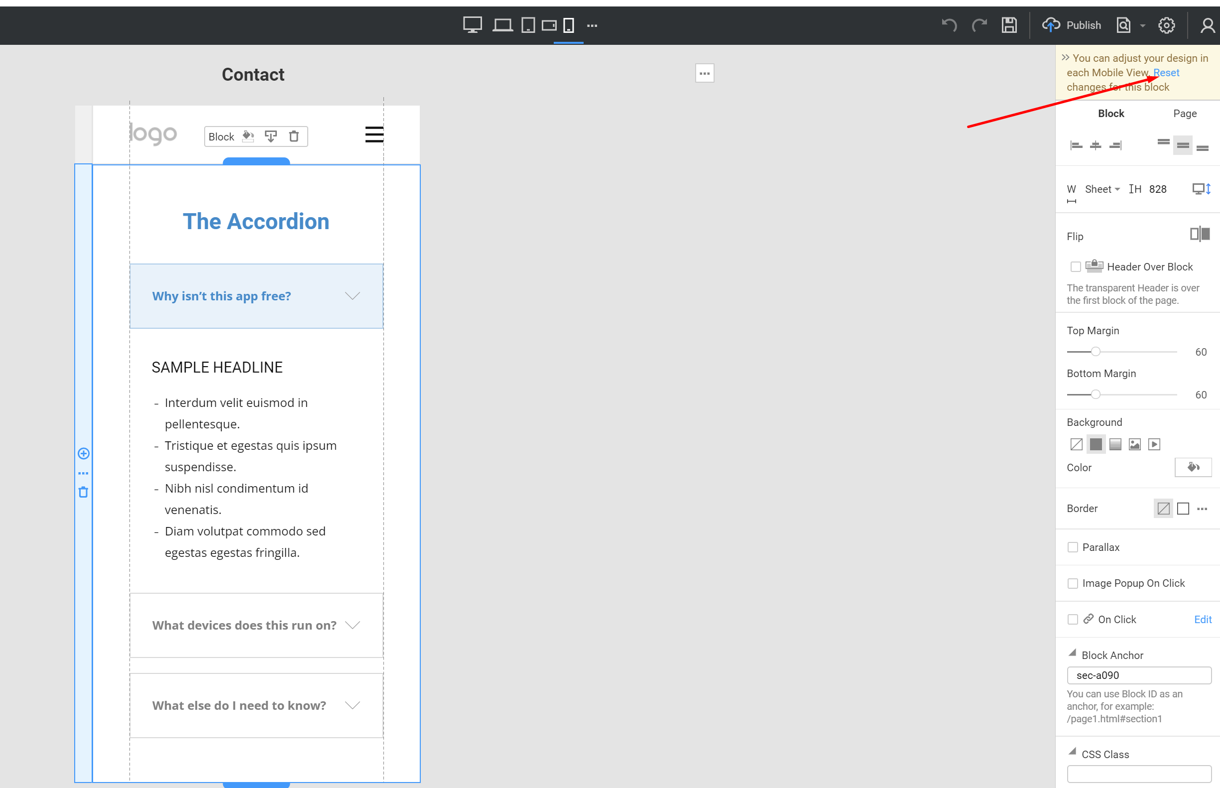
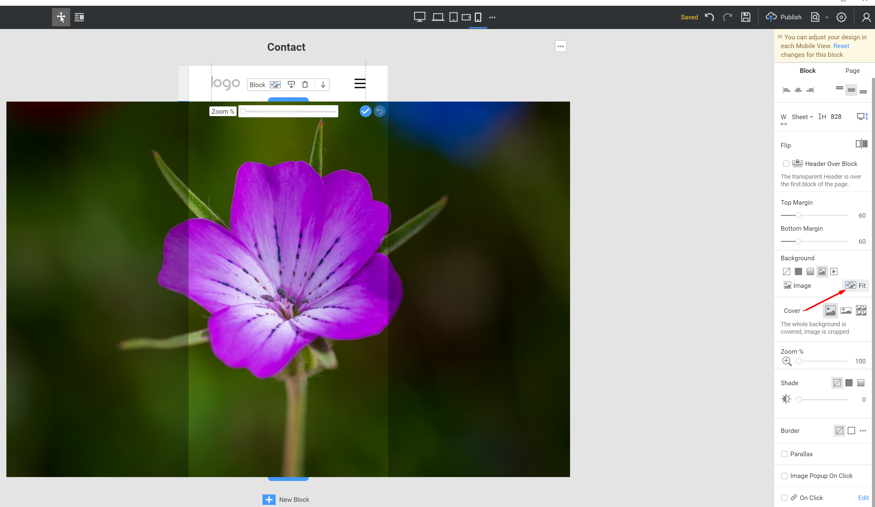
Press Reset responsive after move your box to the top of the block in mobile mode.
Nicepage provides various algorithms to adapt the created layout for smaller screens. But it is impossible to automate everything. Therefore, you need to follow certain rules that will facilitate the page building:
-use the layout controls like Group, Grid, List. This is important when you need to move a few controls together. Also, it is better to use control alignment options available on the right-side panel;
-use the "Reset Responsive" option. Each responsive mode can have its own settings for individual controls. This option removes all adjustments, and you can start all over again. Sometimes this is the best solution. Then you adjust the responsive layout from Desktop to Phone mode.
-keep in mind that not all control settings can be changed in each responsive mode separately. Only some style changes can be made. And only if these changes do not affect the page HTML structure. For example, you can change the position of the element -and move it a few pixels left or right, change font size, etc. But you cannot change the order of elements or move the control outside the Grid/Group.
-keep in mind that there is an inheritance of the responsive settings. It goes from Desktop to Phone mode and stops when you make changes in any responsive mode. You can back to this inheritance with the "Reset Responsive" option.
...................................................
Sincerely,
Anna.
Nicepage Support Team
Please subscribe to our YouTube channel: http://youtube.com/nicepage?sub_confirmation=1
Follow us on Facebook: http://facebook.com/nicepageapp
Hello,
Press Reset responsive after move your box to the top of the block in mobile mode.
Nicepage provides various algorithms to adapt the created layout for smaller screens. But it is impossible to automate everything. Therefore, you need to follow certain rules that will facilitate the page building:
-use the layout controls like Group, Grid, List. This is important when you need to move a few controls together. Also, it is better to use control alignment options available on the right-side panel;
-use the "Reset Responsive" option. Each responsive mode can have its own settings for individual controls. This option removes all adjustments, and you can start all over again. Sometimes this is the best solution. Then you adjust the responsive layout from Desktop to Phone mode.
-keep in mind that not all control settings can be changed in each responsive mode separately. Only some style changes can be made. And only if these changes do not affect the page HTML structure. For example, you can change the position of the element -and move it a few pixels left or right, change font size, etc. But you cannot change the order of elements or move the control outside the Grid/Group.
-keep in mind that there is an inheritance of the responsive settings. It goes from Desktop to Phone mode and stops when you make changes in any responsive mode. You can back to this inheritance with the "Reset Responsive" option.
...................................................
Sincerely,
Anna.
Nicepage Support Team
Please subscribe to our YouTube channel: http://youtube.com/nicepage?sub_confirmation=1
Follow us on Facebook: http://facebook.com/nicepageapp


