Support Team
posted this
28 February 2022
Hi Piotr,
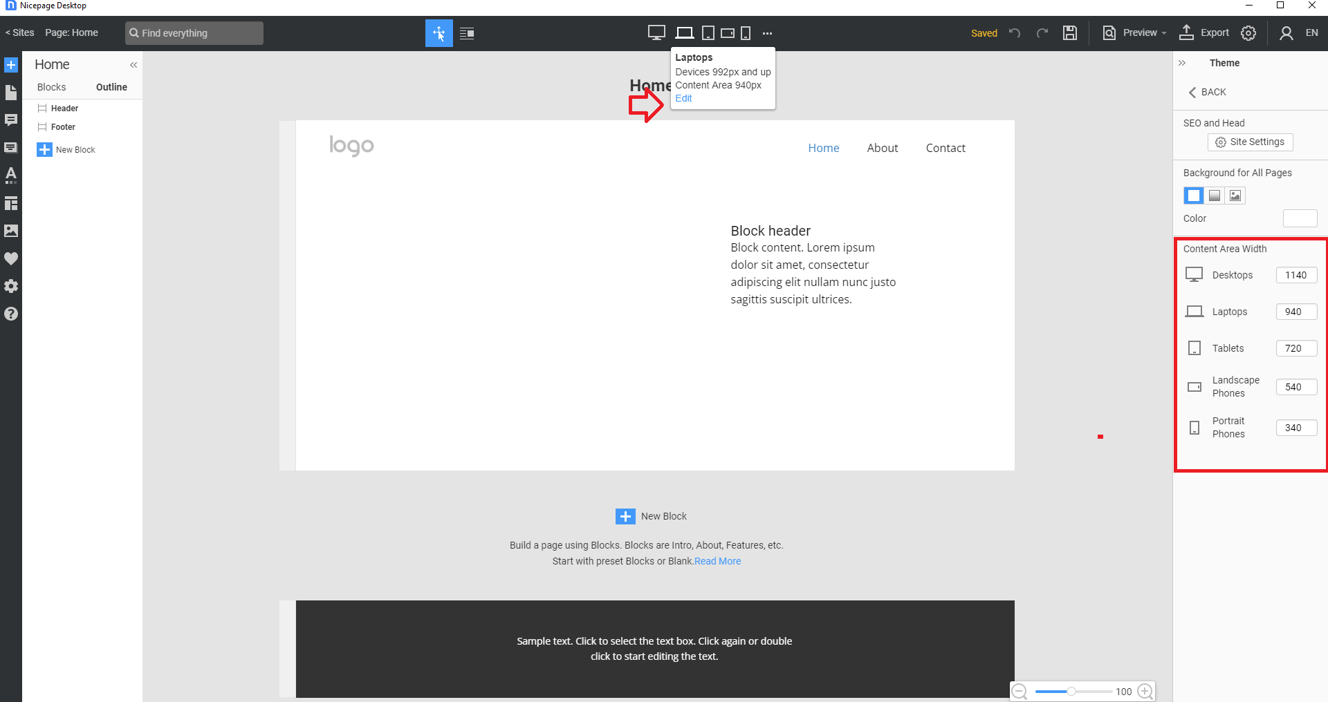
Since we have added a new Large Devices mode (large screens from 1400px)
https://nicepage.com/doc/227798/support-for-large-screens-and-customizable-content-width, you can edit the Content Area Width for each mode (see attached screenshot).
Feel free to test the new Mode and set 320 px for the Portrait Phones Mode to fix the issue you have on iPhone with the enlarged mode enabled.
Let us know if you need further assistance.
...................................................
Sincerely,
Susanna I.
Nicepage Support Team
Please subscribe to our YouTube channel: http://youtube.com/nicepage?sub_confirmation=1
Follow us on Facebook: http://facebook.com/nicepageapp
Hi Piotr,
Since we have added a new *Large Devices* mode (large screens from 1400px)
https://nicepage.com/doc/227798/support-for-large-screens-and-customizable-content-width, you can edit the Content Area Width for each mode (see attached screenshot).
Feel free to test the new Mode and **set 320 px for the Portrait Phones Mode** to fix the issue you have on iPhone with the enlarged mode enabled.
Let us know if you need further assistance.
...................................................
Sincerely,
Susanna I.
Nicepage Support Team
Please subscribe to our YouTube channel: http://youtube.com/nicepage?sub_confirmation=1
Follow us on Facebook: http://facebook.com/nicepageapp
Last edited 28 February 2022 by Support Team


