shane53
posted this
18 August 2021
Originally when I decided to use the Nicepage editor on my client sites I wanted to refer my client to the existing Nicepage demo videos to teach them how to use the editor. However, those videos were done on an old version of Nicepage which makes them almost useless, so I decided to spend hours doing my own, updated ones.
When they created the "Quick Access Panel" I thought "Crap, now it's going to look different from the videos I've done" but thought I could just create an addendum showing this new addition.
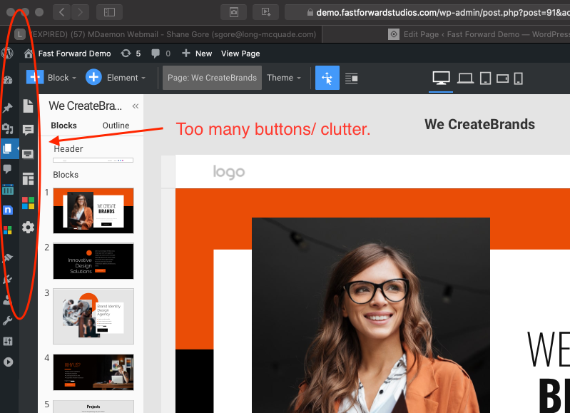
Today I updated Wordpress and had a look at the Quick Access Panel and wonder if this was a bad idea. This panel is very intrusive, and looks awful in the Wordpress editor. It disrupts the natural hierarchy of the UI and just makes things confusing for my clients.
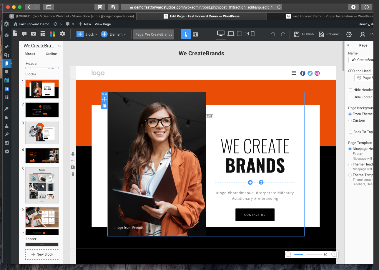
I would rework the UI and put it at the top left where the + Block and + Element buttons are, and slide those to the right. This would allow the menu to open underneath the Quick Access panel buttons which makes sense. The Page: Home and Theme buttons can be removed because they're now redundant via the Quick Access panel. Also putting the buttons here would make more sense in the UI hierarchy: Quick Access (Pages, Posts, Comments, Templates, Theme, Site Settings) -> Add Block -> Add Element etc.
Before:
After:
![Screen-Shot-2021-08-18-at-11.14.22-AM.png]()
Vote to pay developers attention to this features or issue.