

inkblot12
posted this
12 December 2018

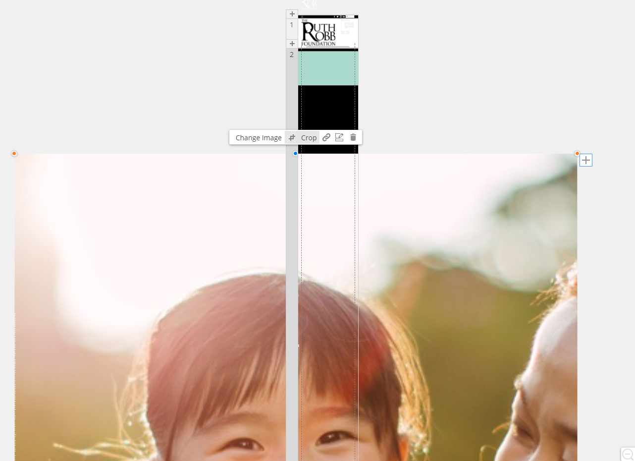
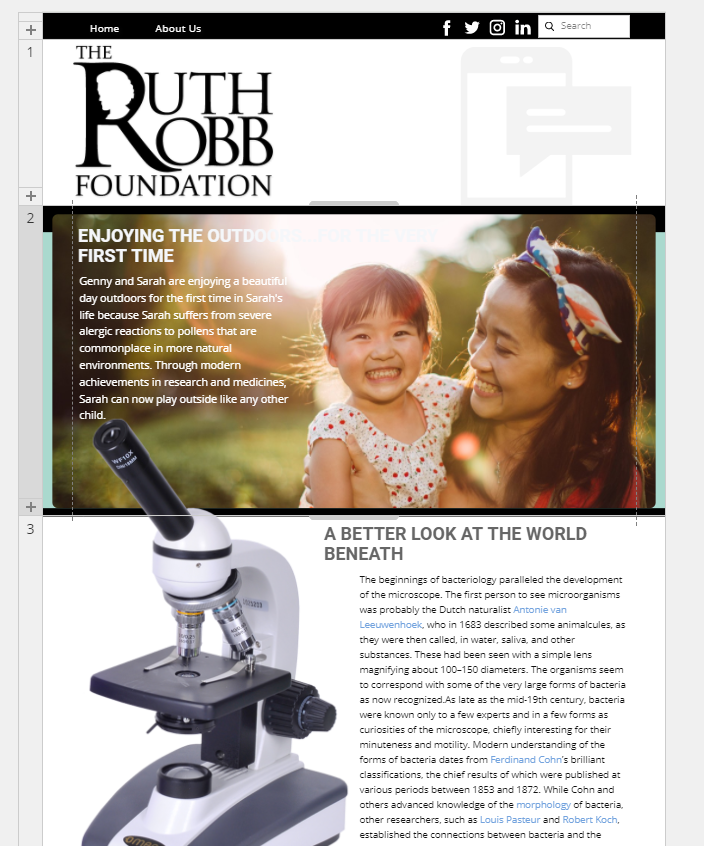
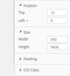
My images look normal in desktop view. But, when I'm in tablet view (on down to phone) the images are huge and will not let me resize them. It's as if they are locked.
I've tried grabbing from the corner and rescaling it but all it does is allow me to change the image horizontally. It wont 'let me rescale vertically. Not sure what is going on.
I've provided some images so you can see what I"m talking about.
Any ideas?
My images look normal in desktop view. But, when I'm in tablet view (on down to phone) the images are huge and will not let me resize them. It's as if they are locked. I've tried grabbing from the corner and rescaling it but all it does is allow me to change the image horizontally. It wont 'let me rescale vertically. Not sure what is going on. I've provided some images so you can see what I"m talking about. Any ideas?Last edited 12 December 2018 by inkblot12
Vote to pay developers attention to this features or issue.


