michal84
posted this
21 October 2020
Hello Nicepage team,
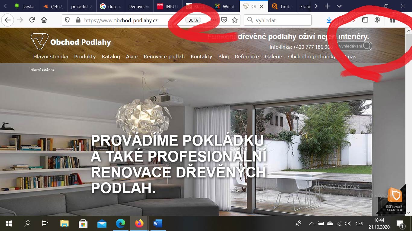
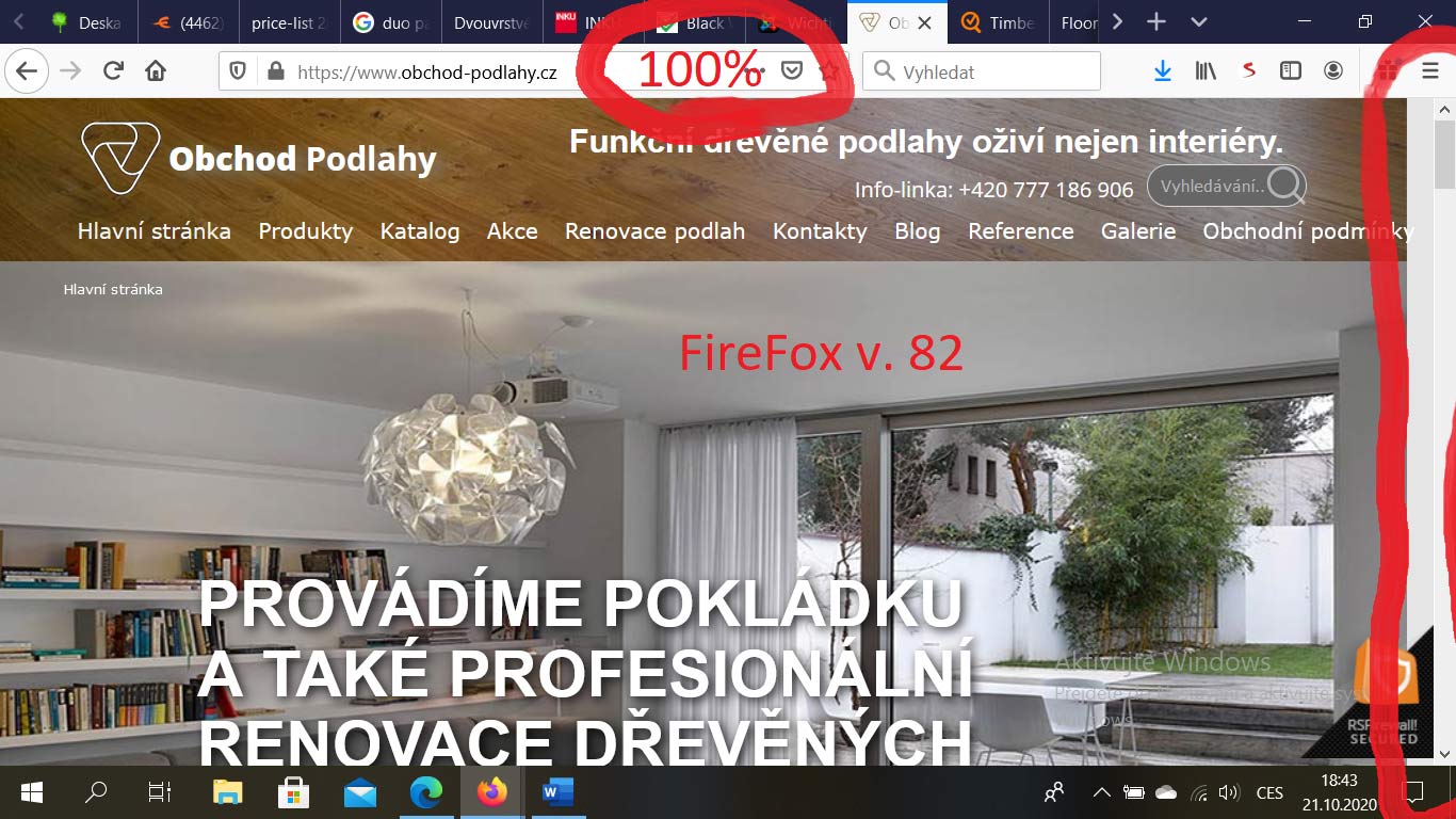
I and my client got contacted by his visitor, who reported to him, that using FireFox web browser in its current version (v. 82), display's the web differently. E.g. there is menu not completely displayed, aside of the vertical scroll bar of the browser appears high tiny vertical gray rectangular shape (see attached images). Only way, how to display the web running on Joomla! properly on Firefox, is to set zoom to 80%, whilst usage of Google Chrome, Microsoft Internet Explorer, Microsoft Edge does not allow to reproduce this issue.
NB, on wich were created attached screenshots has 1366*768 resolution, and the width of the theme is made to 1140px.
Does your templates created by desktop app (current last version 2.28.1 updated yesterday - 20.10.2020), allows to create CSS parts designated for some specific browsers, how it has been used and required long, long time ago, just for the MSIE?
Can you please have a look to the screens, and if required, (after making the thread private), I will attach also the project. Yet today, I was trying to place the position to the header aside of the grid as required by Olivia on another thread because of breadcrumbs, so I cannot provide exactly the same version of project, that is being used on the website https://www.obchod-podlahy.cz . If needed, I can again provide the access to the web administration console for checking the template used.
Thank you very much for your assistance.
Regards,
Michal
Hello Nicepage team,
I and my client got contacted by his visitor, who reported to him, that using FireFox web browser in its current version (v. 82), display's the web differently. E.g. there is menu not completely displayed, aside of the vertical scroll bar of the browser appears high tiny vertical gray rectangular shape (see attached images). Only way, how to display the web running on Joomla! properly on Firefox, is to set zoom to 80%, whilst usage of Google Chrome, Microsoft Internet Explorer, Microsoft Edge does not allow to reproduce this issue.
NB, on wich were created attached screenshots has 1366*768 resolution, and the width of the theme is made to 1140px.
Does your templates created by desktop app (current last version 2.28.1 updated yesterday - 20.10.2020), allows to create CSS parts designated for some specific browsers, how it has been used and required long, long time ago, just for the MSIE?
Can you please have a look to the screens, and if required, (after making the thread private), I will attach also the project. Yet today, I was trying to place the position to the header aside of the grid as required by Olivia on another thread because of breadcrumbs, so I cannot provide exactly the same version of project, that is being used on the website https://www.obchod-podlahy.cz . If needed, I can again provide the access to the web administration console for checking the template used.
Thank you very much for your assistance.
Regards,
Michal
Last edited 21 October 2020 by michal84
Vote to pay developers attention to this features or issue.


