Hur man använder sidfotsblocket på en webbplats

How To Use The Footer Block In Web Design
Today website footer design is one of the most important parts of the website best practices. The footer is where your website's contact details and social media with copyright information are located. As a rule, people add their contact information, phone number, email address, social media icons, etc. Make sure a unique website footer design can change your website style. In some cases, designers for the footer as most important parts consider a year with the copyright symbol. Many firms use their website footer not only for information, but the nice design of the footer can also attract new visitors. However, the footer must align with their website theme and the basic design. A website footer is a piece of content placed at the very bottom of the webpage that is often repetitive on every site page. People think there's no need to use a footer for the real estate website, but it isn't true. Developing a great website footer design helps both your users and your company.
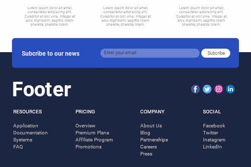
The best website footers with the copyright social media icons perfectly communicate all the necessary information and retain an eye-catching design. Footer enables to display on the website the contact information, social icons, Sign up forms, and so on. The most important elements of the best website footer design may include newsletter subscribers, social media icons, and every information you want to deliver to the visitors. It is customary to add the navigation menu with contact details such as one email address for visitors' communication, keywords in search engine optimization items, etc. Very often, you see the social media buttons on the footer. Great website footer examples allow a nice touch with users and find out what they need to find out on the website. While the footer can be an element placed with the content at the bottom of a webpage, this does not signify the end of a user's experience.
There's no website footer design and common practices adopted to add additional info about the company. Many companies display their footer design examples on the web, and users can appreciate their look. Sometimes it can include different 10 web design examples for one website. Introduce your audience to pertinent information relevant to the area of your website they are concerned with. In some cases, the footer positions the call to action directly in the center, and the light pink subscribe button beside the email contact form draws attention specifically to it. There's no website map in the footer, and the main site menu is fixed on the screen. When your users have been scrolling to the bottom of the page, having read most of the material on the page, they may be persuaded that they are willing to use your services. Creating a great website footer item includes analyzing many aspects of the website.