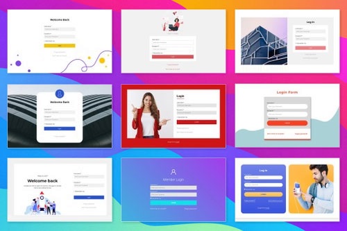
Como usar vários designs de login nas páginas de login

How To Use The Login Page Designs To Improve The Overall Web Experience
The Login Page Design, which you can use in website building both as examples and templates that utilize best practices, will greatly help you build not a simple login page with input fields and caps lock notifications but a login form page that will maximize the UX design impression. It will signal your visitors to log in to your login form or go to the login page to enjoy your website's content fully. Or, if you want a simple login form for your login page, you can make it in a few clicks using the quick-access templates panel and customize your login page after you pick the template you want.
A modern standard login screen for site visitors is often using their email address and phone number or using their social media login, registering them in the website's system and creating a new account. The procedure seems simple and seemingly requires no effort from web designers. Yet if you look at the top best login page examples or sign up form examples, you will immediately notice the importance of their login page design in future projects. When you design a login form and sign up buttons and input fields, it is important to check the good login page design and learn the UX design it utilizes.
To provide the best design user experience, remember the purpose of login forms for websites. The login screen must provide a short number of the input field positions, where users need to log in quickly to continue exploring your website. The login form must inform users if they have an account in your system. Instead, suggest users sign up or let them create a new account if they want. Also, notify if they are using their caps lock and use their social media accounts to register in login forms. Using social media platforms as the source of your visitor's info instead of email is very useful for user experience and site promotion.