Summary
- Overview
- Important Tip
- Reset Responsive
- Support for Large Screens
- Enable Large Screens Mode
- Content Area Width
Overview
Nicepage supports all modern Screens and Mobile Views, also called Responsive Modes, including Large Screens, Desktops, Laptops, Tablets, Horizontal, and Vertical Phones.
You can edit the layout and properties for each Mobile View and modify various Element Paraments, for example, Font Size, Margins, etc. Switch the modes to see how a web page looks on each device.
Important Tip
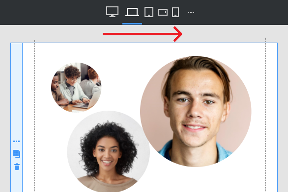
VERY IMPORTANT: We recommended making changes in the Responsive layouts starting from the largest Mode to the smallest.
Reset Responsive
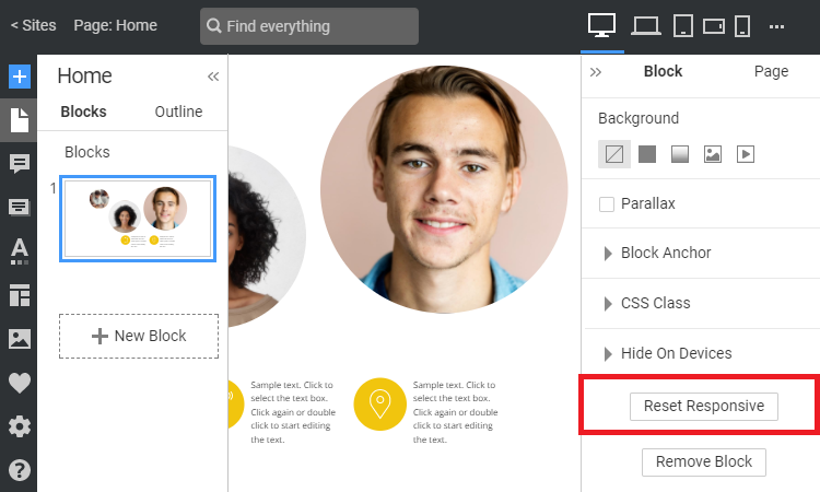
You can reset the Responsive Layouts any time by clicking on the Reset Responsive button in the Property Panel for the selected Block.
Support for Large Screens
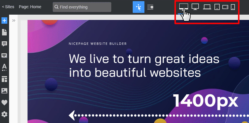
You can design matching the latest trends for monitors and devices with large screens from 1400px.
Enable Large Screens Mode
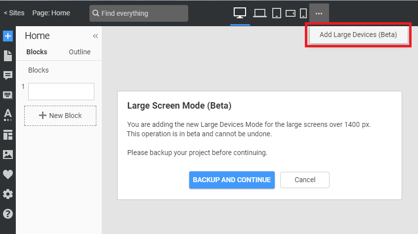
NOTE: By default, the Large Screens Mode is hidden. To enable the new Large Devices Mode, click on the Options icon and the "Add Large Devices" link.
There is a dialog to back up your project.
Content Area Width
If needed, you can modify the Content Area Width for each screen view.
## Summary
- Overview
- Important Tip
- Reset Responsive
- Support for Large Screens
- Enable Large Screens Mode
- Content Area Width
## Overview
Nicepage supports all modern Screens and Mobile Views, also called Responsive Modes, including **Large Screens**, **Desktops**, **Laptops**, **Tablets**, **Horizontal**, and **Vertical** Phones.
You can edit the layout and properties for each Mobile View and modify various Element Paraments, for example, Font Size, Margins, etc. Switch the modes to see how a web page looks on each device.
## Important Tip
**VERY IMPORTANT:** We recommended making changes in the Responsive layouts starting from the largest Mode to the smallest.
!responsive-important-tip.png!
## Reset Responsive
You can reset the Responsive Layouts any time by clicking on the Reset Responsive button in the Property Panel for the selected Block.
!block-reset-responsive.png!
## Support for Large Screens
You can design matching the latest trends for monitors and devices with large screens from 1400px.
!responsive-large-screens.gif!
## Enable Large Screens Mode
NOTE: By default, the Large Screens Mode is hidden. To enable the new Large Devices Mode, click on the Options icon and the "Add Large Devices" link.
!large-devices-mode-message.png!
There is a dialog to back up your project.
## Content Area Width
If needed, you can modify the [Content Area Width](page:299189) for each screen view.
##