Sitenin Başlığında Arama Kutusu nasıl kullanılır?

How To Help Users With The Search Box To Find Needed
When building your site, you must consider any frequently used design element and its best practices. The most commonly used site element is the search box for users that allows users easily find anything they want. The search box should improve the website page of any site and should allow users to navigate your site effectively. Provide the search button, and it will help analyze what users need and how they are constructing their search query on your site. Compare their search query and then include a sample search query for future use to make up the user experience.
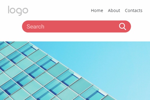
Place the search box site button next to the site heading at the top left and top right not only because most creators tend to place the search plugin there, but also because if you place implementing search boxes and submit button appropriately, users could easily find the right content. Consider improving the input field submit button with one or several advanced search options to widen their search options. If your content is voluminous, filters advanced search options will maximize the user experience. The site search form is also a design element so that any new ideas may improve the search box design and future search boxes.
The magnifying glass icon many users consider a universal site search button, and it is a key that will allow users to find their search function quickly. When designing a search box, make sure that many users still prefer the classic approach for reasonably most frequently used design of the input field of search boxes. So making the input field very short will leave min read space for the advanced search. Additionally, the input field may leave the submit button as a magnifying glass with fewer design solutions. Modify the search box so there would be a combination of prominent features and new ones.