xvemanuelvx
posted this
17 July 2024
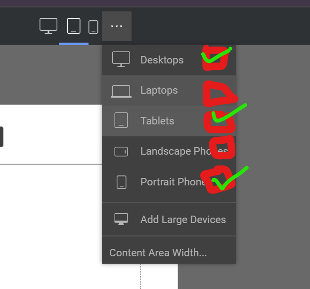
Nicepage recently started displaying only three device sizes instead of the usual five. At first I thought that the other two would be omitted and their breakpoints overwritten, but this is not the case. The missing device sizes only completely confuse the responsive design.
I know you can add the device sizes again. But that's just cumbersome and annoying.
And if you do, you need a checkbox (I drawed a sketch on a screenshot) or something similar for the device size selection so that you know which are now added and which are not. I always have to guess and click through all the options.
!Screenshot-2024-07-17-205913.png!
Vote to pay developers attention to this features or issue.


