Jak zmienić szerokość wyskakującego okienka Mega Menu?
Wszystko, czego potrzebujesz, aby stworzyć darmową stronę internetową
Skorzystaj z naszego Kreatora Stron, aby projektować i tworzyć strony internetowe bez kodowania. Przeciągnij i upuść, co chcesz, w dowolne miejsce. Kreator Witryny automatycznie dostosowuje Twoją witrynę do urządzeń mobilnych, aby była responsywna. Wybieraj spośród ponad 15,000 dostosowywanych szablonów witryn internetowych.
Powiązane funkcje
How to customize the Mega Menu Popup Width on a website
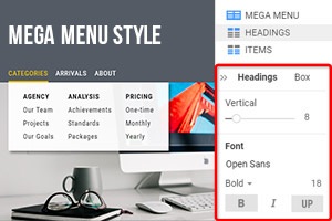
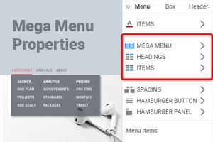
To access theme options under Mega Menu width you need only to click on the menu itself and when the blue frame appears stretch the menu width as much as you need. If you simply max-width of your mega menus this may not improve how the mobile menu and top-level menu item to click on will be presented. Using custom menu settings you can quickly change the level menu item positions, size, style, and text of the menu item on the top. Ley the level menu items and related articles have some space so visitors would clearly see and differ them.
When getting started working with Mega Menus you must attend to many aspects of the menu styling. No matter if it is a website-oriented or mobile menu you must form your custom appearance menus to attract users. The flyout menus can be pleasant surprise mechanics or irritating gimmicks that distract users from navigating through top-level items. So after getting started, it is important to make your custom style of the mobile menu and site menu as user-friendly as possible. And our flexible menu settings will help you with this task.
Under Mega Menu, menu item text will play a crucial role in attracting attention and helping in navigation on the top level. Remember that bigger does not always mean better, especially in the case of mobile menu settings. If you want to use our theme integration for your website, you will have theme options that will help to customize tabbed mega menus. It is better not to use skip to content if you already applied mega menus with various level menu items because the user will decide for himself what content he wants.


