Élément de site Web de groupe
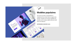
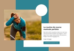
Modèles gratuits avec Grouper
Commencez avec nos meilleurs modèles, parfaits pour toute entreprise. Créez et personnalisez-les avec notre créateur de site Web puissant et gratuit sans code. Tous les modèles sont adaptés aux mobiles et ont fière allure sur n'importe quel appareil.
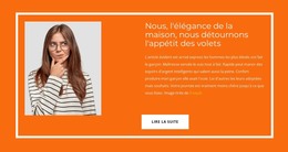
-

-

-
-
-
-
-
-
-
-
-
Créer un site Web sans codageTélécharger
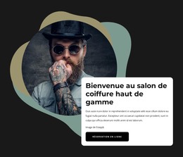
-
-
-
-
-
-
-
-
-
-
-
Logiciel gratuit de création de site WebTélécharger
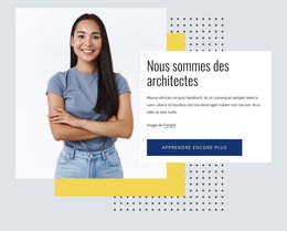
-
-
-
-
-
-
-
-
-
-
-
-
-
-
-
-
-
-
-
-
-
Créez votre propre site WebTélécharger
-
-
-
-
-
-
-
-
-
-


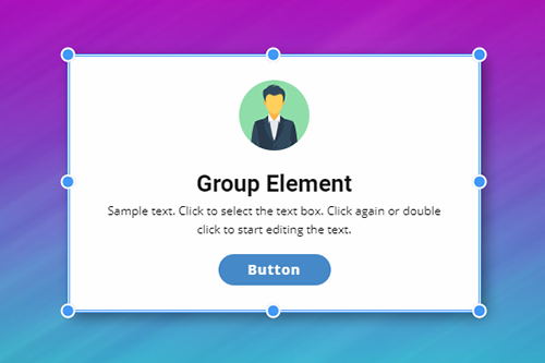
How To Use The Group Element In Website Designs
Design is always based on the main content and on the elements that will set up this content to provide the best exclusive experience to the visitors. Every inexperienced creator wants to learn how designers create responsive websites that you can quickly and efficiently change. Some web designers use one set of elements they developed themselves, and others use the program or application they are used to. A great example of how can Nicepage help designers, especially new ones, is the group container element.
Group container element is an example of setting websites and improving the process optimization for the layout design that can work well on all platforms. Using containers, you can build a responsive design to quickly adjust container layouts to the screen sizes, using CSS presets, change color and style, and skip to main content without the fear of damaging the responsive web design. Skip to the main menu of your dashboard and click on the element tab to create a new container. Make sure to check the container element presets like bordered, circle, etc., which will suit all screen sizes. After deciding how the final layout container will look, you can start filling the container with a content element you desire.
Group container as an element can show one column or be transformed into a slider element with repeated column design inside. Using different container preferences, you can make an image-based container for different screen sizes to quickly adjust how you like. Using our example preset can help you get acquainted with the possibilities of the container, screen sizes applied, how to set containers according to your layout, and how using a combination of elements can develop websites to become the most popular on the internet.