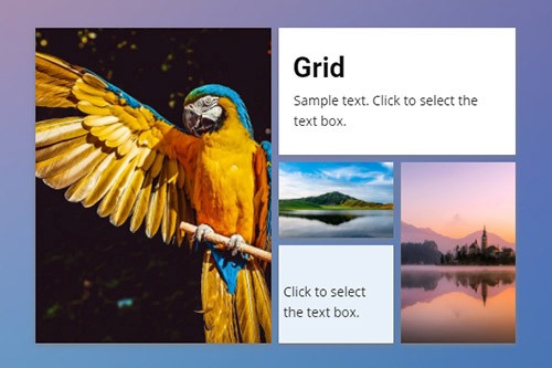
Grid Website Element


How Grid Works On Mobile Devices
Use the Grid Element to make the Responsive Modes easily. On the smaller screens, the Grid Cells move one under another automatically.
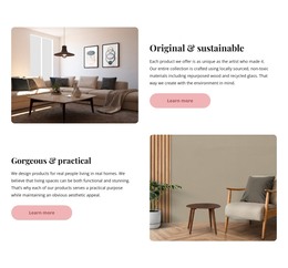
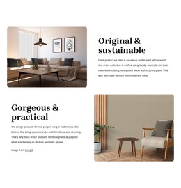
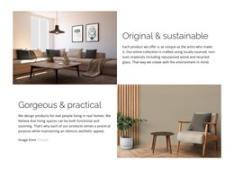
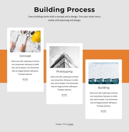
80+ Grid Layouts
Get the widest variety of Grid layouts for your web design. The Grid Elements helps you to make your designs mobile-friendly automatically.

How To Move Grid Cell
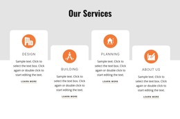
The Grids allow organizing various content, including images, icons, shapes, and text in the form of cells, which are very convenient to operate. In our visual editor, you can easily move cells in a Grid by simply dragging one Cell over another, perfecting your layout and content for your web design. In addition, you can click on the Arrow Icons on the Cell's context tool to move the Cell.
Free Templates with Grid
Get started with our best templates, great for any business. Create and customize them with our powerful and free website builder with no code. All templates are mobile-friendly and look excellent on any device.